Hello! I’m Julie Lamping, a research analyst at Harper College in Illinois. A lot of what I do is extracting data that is needed, formatting it into tables or charts, and providing a basic analysis to be used during decision making at the College. No matter the project, everything gets thrown into Excel at some point.
I absolutely love pivot tables and charts! I use them for simple validation, creating crosstabs and charts, and building dashboards. Excel has its limitations (*cough*itdieswhenthereistoomuchdata*cough*), so pivots aren’t miracles for everyone (just maybe for some of you).
Start with [fairly] clean data in Excel. Go to the INSERT tab and select PivotTable. Boom, now you have a pivot table (seriously, that’s it). Like everything Excel spits out at first, it is ugly. PivotTable Tools tab will help you design the table to look however you want. You can even group items together. LifeProTip: have your color palette ready by creating a custom style theme in Microsoft.
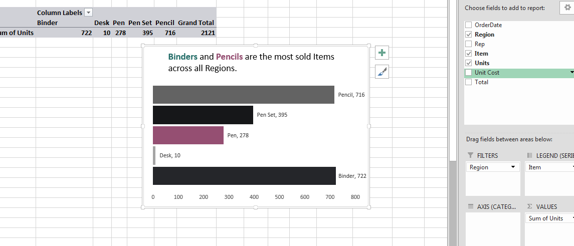
We’re data visualization people, so if you go back to your sheet with your data, Insert a PivotChart the same way you would a table (hint, it’s usually located by the other charts under the INSERT tab).
Format that bad boy with all the data visualization standards and skills you have. It looks so good (probably).
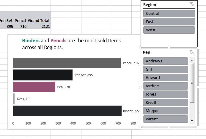
But say youwant to give someone else the option to filter the chart how they want – we can do that! While the PivotChart is selected, head on over to the ANALYZE tab and hit “Insert Slicer”. Select the fields from your PivotTable you want and click OK. LifeProTip: I use this function when creating dashboards in Excel.
Any selection on the slicer will filter your PivotTable and PivotChart. Hint, these slicers can also be customized to be appealing – I usually make mine gray but Harper’s blue when selected.
 Extra fun dashboarding – you can move your PivotTables and Charts using the Move Chart function. If I’m creating a dashboard in Excel, I move my final Charts and Slicers over to new sheet (usually renamed DASH for my sanity) and hide the rest of my mess.
TL;DR: Select the first cell in your excel table and insert a PivotTable or PivotChart. Format and modify as needed. Insert Slicers if you are always extra like I am, then move to a separate sheet for quick dashboard.
Happy Excel’ing!
Rad Resources:
For newbies to Pivots in Excel: Ann Emery’s Introduction to Pivot Tables
Jon covers finalizing the dashboard: Youtube Video on Excel Dashboarding by Jon from Excel Campus
All things dashboard’ing in Excel: SmartSheet’s Post on Excel Dashboards
Shameless plug: My [sassy] tutorial
The American Evaluation Association is celebrating Data Visualization and Reporting (DVR) Week with our colleagues in the DVR Topical Interest Group. The contributions all this week to aea365 come from DVR TIG members. Do you have questions, concerns, kudos, or content to extend this aea365 contribution? Please add them in the comments section for this post on the aea365 webpage so that we may enrich our community of practice. Would you like to submit an aea365 Tip? Please send a note of interest to aea365@eval.org. aea365 is sponsored by the American Evaluation Association and provides a Tip-a-Day by and for evaluators.


Great refresher, thanks Julia 🙂
Kudos on a great post, Julie!
I’ve begun saying that I’m “quasi-religious” in my support of Pivot Tables. Call me crazy, but I think we should require intro pivoting skills as a piece of high school curricula, much less evaluation competencies.
With local clients here in New Orleans, I often end up training them in pivots at one point or another (or at least I want to). It’s THE generalized, fast, and non-code-based solution to such a HUGE range of data analysis needs.
Thanks for highlighting the resources on dashboards as well. Hadn’t gotten that far on that front yet!
If you’re using Excel for Mac computers, don’t bother trying to make pivot charts. Unfortunately, that is not a available feature for Mac users, which is ridiculous.