I’m Billi Shaner, Senior M&E Advisor at InformEd International and Co-President of the AEA Local Affiliate in Seattle. At InformEd, we provide evaluation services to international development clients, focusing in the areas of education, health, and livelihoods. For some time, I’ve been intrigued by the potential of Tableau’s platform to encourage our clients to interact and engage with report findings in a new way. A recent evaluation included numerous data, the analysis of which would be used by staff at all levels throughout the organization, so we wanted a reporting mechanism that would encourage them to draw their own insights. I used this opportunity to create my first Tableau dashboard and storyboard.
There is a learning curve to using Tableau, but I found it to be much simpler than some other platforms, especially if you view Tableau’s free training videos before getting started. Our work with this client involved calculating the effect size of reading improvement among primary school students in an effort to compare those results across 11 country program sites with different methodology considerations and technical details. Tableau allowed us to visualize the data in a variety of ways, including by location through the use of its map functionality. Adding other dashboard filters allows for viewing the results by region or effect size classification. Within the map, there are a variety of features for changing the look of the map, including isolating the area you’re viewing away from the rest of the map, adding terrain, cities, and points of interest, and if it’s a U.S. map, adding zip codes, area codes, and metro boundaries. These settings are found in Map Layers under the Map menu. You also have the ability to import custom geocoding. If you’d like to learn more the project and interact with the dashboard or storyboard, click here.

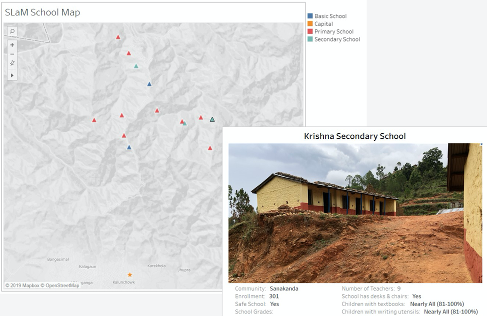
Cool Trick: The hover functionality in Tableau, called a Tooltip, is helpful for sharing specific data points without obscuring your dashboard. For the effect size project, we included the methodology considerations and technical details that varied by site. For another project, the geography in rural Nepal plays a key role in understanding each community’s challenges and our client’s ability to access to area schools. Tableau allows you to add pictures to the Tooltip, which our client found very beneficial for this interactive map (see image below).

Rad Resources: When I get stuck with Tableau, I often find an answer through the Tableau Community Forums or on Ryan Sleeper’s PlayfairData blog. Here’s a link to Ryan’s guidance on adding images to a Tableau Tooltip.
The American Evaluation Association is celebrating Data Visualization and Reporting (DVR) Week with our colleagues in the DVR Topical Interest Group. The contributions all this week to aea365 come from DVR TIG members. Do you have questions, concerns, kudos, or content to extend this aea365 contribution? Please add them in the comments section for this post on the aea365 webpage so that we may enrich our community of practice. Would you like to submit an aea365 Tip? Please send a note of interest to aea365@eval.org. aea365 is sponsored by the American Evaluation Association and provides a Tip-a-Day by and for evaluators.

I’m delighted my analysis has proven so helpful and clarifying for you. It is truly rewarding to know I’ve been able to distill the research into actionable insights that add genuine value. Helping you determine the optimal platform in an efficient manner is incredibly gratifying. I aimed to synthesize the key considerations and trade-offs to spotlight the solution matching your needs. It’s feedback like yours that inspires me to constantly enhance my approach – to not just provide information but achieve real-world impact through judicious analysis. I appreciate you taking the time to validate the usefulness of my work. Your words of appreciation are high motivation to keep refining my process and delivery to empower decision-making for clients like yourself. Please don’t hesitate to reach out if you need any additional details as you move forward. It’s been a privilege to play a role in catalyzing your progress.
Thank you so much for providing such a detailed analysis. It has helped me save time and energy trying to figure out the best platform for me!
ServiceNow Training in Pune
great post, thanks for sharing, keep posting.
Tableau training in Hyderabad