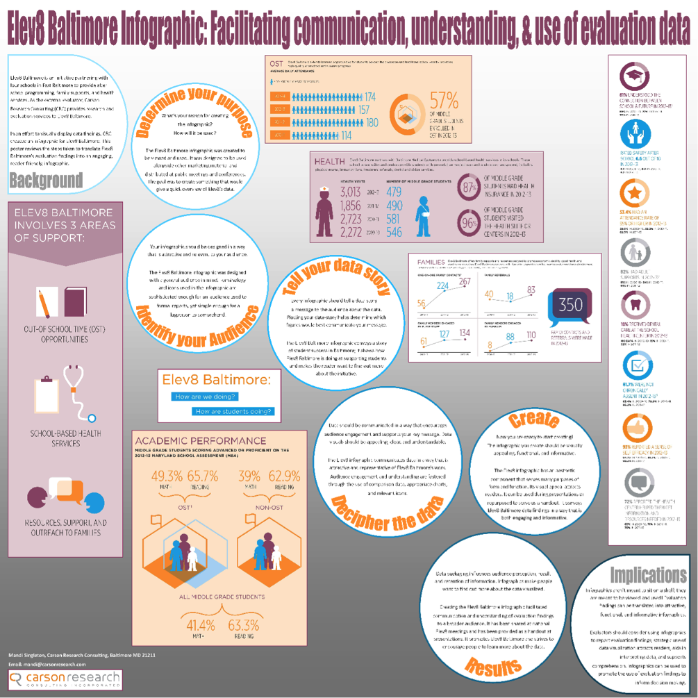
Hi! I’m Mandi Singleton, Research Assistant at Carson Research Consulting (CRC) in Baltimore, Maryland. Last October I attended Eval 2014 and gave a poster presentation on the process, results and implications of translating data findings into an infographic. My main focus when designing the poster was graphical content. I wanted to impress upon viewers the impact that data visualization can have on audience perception, recall and retention of information. My overall goal was to encourage people to think about the benefits of translating findings into an infographic.
Hot Tips: Below are the steps I took to design my poster:
Step 1: Identify the basics.
Determine the purpose, audience and key message of your poster. These things will help inform the content of your poster.
Step 2: Determine content.
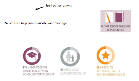
All content should be supportive of your key message and catered to your audiences’ level of knowledge. Be mindful of terminology, acronyms and icons used in your poster.
Step 3: Sketch your design.
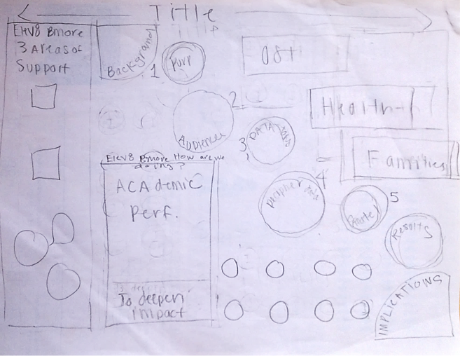
I sketched the layout for my poster using pencil and paper, but you can use whatever medium you like. The goal here is to get an idea of how you want your poster to look.
Hot Tip: Sketch your design on a paper that is the same size your poster will be. This helps with spacing and determining the placement of content.
Step 5: Create!
My poster was created using Microsoft Publisher 2013.
Insert your content. Most of my visuals were directly inserted into Publisher as image files. You can also create charts/data visuals in another program (like Excel) and paste them straight into Publisher.
Guide viewer’s eyes by creating visual paths of interest. This can be achieved through the use of color, varied font types and strategically placed shapes.
Determine the color scheme. My posters color scheme was orange, gray, burgundy and blue. Orange and gray were chosen because they’re our company colors; burgundy and blue were selected because they looked nice with our company colors.
Hot Tip: You can apply color schemes in Publisher; create your own or select a pre-made one.
Rad Resource(s): For help selecting a color scheme, visit Adobe Kuler (provides RGB & HEX codes) or HailPixel (provides HEX codes).
Step 6: Prepare poster for printing.
Before printing, check for things like spelling errors, objects in non-printable regions and poor image resolution.
Hot Tip: If you’re using Publisher you can run ‘Design Checker’ (found on the home tab) to find problems in your poster for you.
Do you have any other tips for creating a poster presentation? Share by leaving a comment below!
The American Evaluation Association is celebrating Data Visualization and Reporting (DVR) Week with our colleagues in the DVR Topical Interest Group. The contributions all this week to aea365 come from DVR TIG members. Do you have questions, concerns, kudos, or content to extend this aea365 contribution? Please add them in the comments section for this post on the aea365 webpage so that we may enrich our community of practice. Would you like to submit an aea365 Tip? Please send a note of interest to aea365@eval.org. aea365 is sponsored by the American Evaluation Association and provides a Tip-a-Day by and for evaluators.


This is great and very timely! Thanks for providing the step-by-step process. It is very helpful!