Hi! I’m Kate Diaz, Senior Manager for Corporate Measurement, TechnoServe. When working with data visualizations, it can sometimes be difficult to craft the message that drives home the key insight for your audience. That was an issue we faced as we began to plan for our 2016 Impact Report, which uses data visualizations to help readers understand key aspects of TechnoServe’s impact. Thanks in no small part to the expert guidance from AEA’s Ann Emery, however, we finished with a report that makes a strong, clear argument for our impact.
Lesson Learned: While creating the report’s data visualizations, I learned how much the revisions process helps refine and isolate the message. When drafting a visualization, I often start out with three or four insights from the data that I want to convey to readers. Through revisions, by sharing the visualization with others, and putting it aside and coming back to it, I hone in on the exact message that drives the report’s narrative. The revisions process helps identify the message just as much as it helps identify the right visual.

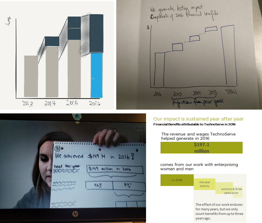
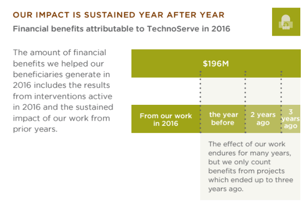
For example, a key visualization in the 2016 Impact Report illustrates how we assess Financial Benefits, a measure of increased revenue and wages. Early iterations, shown above left, explored the idea of impact flows over time. But we were really interested in talking about 2016 impact, not a trendline. We tried a waterfall chart, which showed the composition of the whole but still accentuated a chronology. Doing away with a timeline, we tried stacked bar charts. These ultimately helped us identify the key insight for readers: that this year’s impact is a result of work we’re doing this year and the sustained impact from prior years. A few iterations later, our message was clear:

After so much effort, it can be hard to let go of the other hard-won insights about our impact in order to isolate the one that best fits the narrative. I’m often tempted to try to convey three or four different insights in one graph. But the result is a busy, messy visualization that is unsuccessful at driving any message home. TechnoServe’s annual impact report is a printed document, so space is limited, but online or presentation versions are more flexible. They are an opportunity to explore the insights that didn’t make it into the printed report.
Data visualization is certainly about the destination: it’s important to land on the graph that clearly conveys the intended message. But the journey, the revisions process, will ensure you get there. Happy graphing!
The American Evaluation Association is celebrating Data Visualization and Reporting (DVR) Week with our colleagues in the DVR Topical Interest Group. The contributions all this week to aea365 come from DVR TIG members. Do you have questions, concerns, kudos, or content to extend this aea365 contribution? Please add them in the comments section for this post on the aea365 webpage so that we may enrich our community of practice. Would you like to submit an aea365 Tip? Please send a note of interest to aea365@eval.org. aea365 is sponsored by the American Evaluation Association and provides a Tip-a-Day by and for evaluators.

Great work Kate and team. I just pulled up TechnoServe’s 2016 Impact Report an hour ago during a coaching call as an example of a report that successfully translates technical information for semi-technical and non-technical readers. The coach-ees were impressed with your work!