

I’m Robin Taylor, Principal and Senior Evaluator of RTRES Consulting, a small business established to help STEM programs grow through data-driven evidence. I wanted to share an effective and practical way to demonstrate the range of item difficulties of pre-post-test items. This approach is not intended to demonstrate the validity of a test, but is
a pragmatic way to explore properties of test items that require simple computations and can be effective for determining items/questions which stand out as ‘too easy’ or ‘too difficult’ for the target population. Data visualization best practices can be used as a tool to communicate to your client the range of difficulty present for the test items with the target population, and can be used to focus attention to a subset of test items for further review based on the presence of ceiling effects (very easy items) or floor effects (very difficult items).
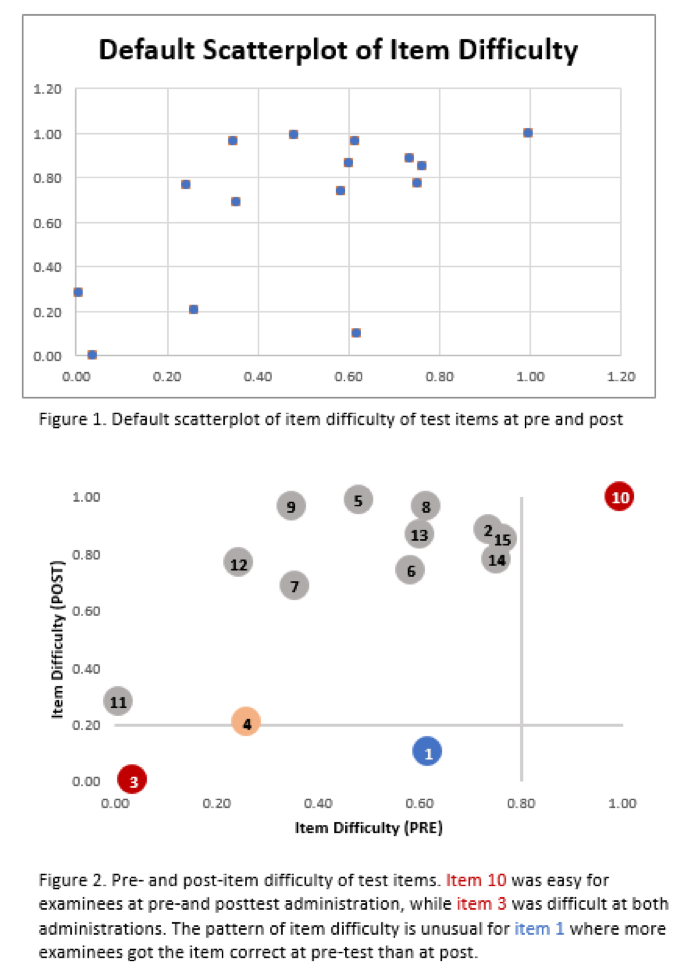
Item difficulty is computed as the number of correct responses for an item, over the total number of responses (correct and incorrect) for the item. Item difficulty values range from 0 to 1.00, where 0 represents no examinees got the item correct (difficult items), and 1.00 indicates every examinee got the value correct (easy items). Thus, item difficulty can be presented on a continuum of 0 to 1 and visualized using a scatterplot graph.
Hot Tip: Add lines to flag items which demonstrate ceiling effects (too easy at pre- and post, thus minimal room to assess learning gains) and floor effects (too hard at pre- and post, also indicative of items demonstrating minimal effectiveness for assessing learning gains). Please note: although I use .20 as a benchmark, this is an arbitrary value and subject to ongoing investigations for the appropriateness of what constitutes meaningful values.
Cool Trick:
Use data visualization best practices to turn your default figure into a visual story:
- Verify range of default axes
- Remove unnecessary clutter
- Add benchmark lines
- Increase marker size
- Label markers with test item number
- Use color to draw the reader’s attention
Rad Resources: I learned how to create this graph using resources from Dr. Stephanie Evergreen, Evergreen Data! She offers books, workshops and a data visualization academy that provide tools to create graphs like this in Excel or R. Other resources I find useful include Ann K. Emery and the following books: Storytelling with data and The Big Book of Dashboards.
Lesson Learned: I use these data visualization techniques to communicate to my clients the appropriateness of test items to assess learning gains as the figures show 1) the range of item difficulties at pre/post and 2) pinpoint test items for further review. In the past these techniques have helped identify the correctness of answer keys, explore the wording of questions and distractors, and determine the appropriateness of items for the target population – which have thus resulted in revising, removing, or replacing test items.
The American Evaluation Association is celebrating Data Visualization and Reporting (DVR) Week with our colleagues in the DVR Topical Interest Group. The contributions all this week to aea365 come from DVR TIG members. Do you have questions, concerns, kudos, or content to extend this aea365 contribution? Please add them in the comments section for this post on the aea365 webpage so that we may enrich our community of practice. Would you like to submit an aea365 Tip? Please send a note of interest to aea365@eval.org. aea365 is sponsored by the American Evaluation Association and provides a Tip-a-Day by and for evaluators.