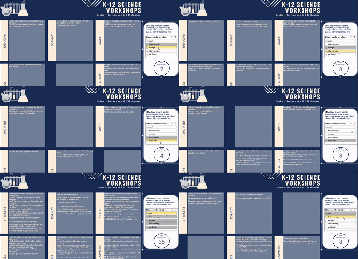
Hello everyone! This is Shelly Engelman and Tom Withee. While we’ve shared many examples in the past on building interactive data dashboards in Excel, we’re thrilled to introduce you to a powerful tool for visualizing data: interactive QUALITATIVE dashboards.
While many of us are familiar with visualizing quantitative data, open-ended survey responses often get overlooked and under utilised. However, these rich, narrative insights are just as crucial. With interactive qualitative dashboards, you can bring those insights to life! The beauty of these dashboards is that they allow you to slice and dice open-ended responses in real-time based on a multitude of factors like different demographic groups or satisfaction levels. And the best part? You can create them using Microsoft Excel—no advanced software required!
Imagine being able to see, in just a few clicks, what participants who “would NOT recommend” a program said. Want to know what those with high satisfaction said compared to those with low satisfaction? You can filter and explore these narratives on the fly, giving your data even more depth and context.

Cool Trick:
Slicing Qualitative Responses by Demographics
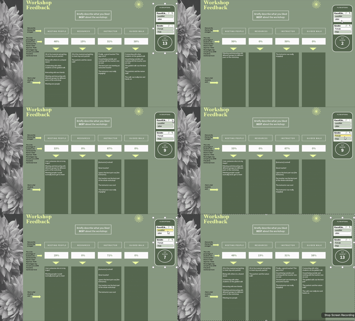
One of the most exciting aspects of interactive qualitative dashboards is the ability to slice responses by demographic variables. Want to know what girls/women from historically under-represented minorities are saying compared to white men? Or see how participants from different age groups express their experiences? With a few clicks, you can drill down and compare what various sub-groups of people have said. This gives you a richer, more nuanced understanding of your data. This tutorial will show you how to develop “filter” menus or slicers using Microsoft Excel.
Hot Tip:
One of the great features of interactive qualitative dashboards is the ability to show the percentage of participants who mentioned a particular theme. This gives stakeholders a clear sense of proportionality and helps highlight how frequently certain topics come up. However, keep in mind that participants’ responses can often touch on more than one theme, meaning the percentages won’t necessarily add up to 100%. For example, a participant might mention both satisfaction with customer service and concerns about pricing in a single response. Check out the dashboard below to see how it works in action!

Rad Resources:
Free Qualitative Dashboard Templates Using Excel
Ready to dive into the world of qualitative dashboards? We’ve created 3 FREE downloadable templates using Microsoft Excel to help you get started. Grab your free templates here.
The American Evaluation Association is hosting Data Visualization and Reporting (DVR) Week with our colleagues in the DVR Topical Interest Group. The contributions all this week to AEA365 come from DVR TIG members. Do you have questions, concerns, kudos, or content to extend this AEA365 contribution? Please add them in the comments section for this post on the AEA365 webpage so that we may enrich our community of practice. Would you like to submit an AEA365 Tip? Please send a note of interest to AEA365@eval.org. AEA365 is sponsored by the American Evaluation Association and provides a Tip-a-Day by and for evaluators. The views and opinions expressed on the AEA365 blog are solely those of the original authors and other contributors. These views and opinions do not necessarily represent those of the American Evaluation Association, and/or any/all contributors to this site.

Thank you for sharing how to build interactive dashboards in Excel! I am going to use this post to help me redesign my Looker Dashboard. I love how you explain how to integrate frequency coding to provide emphasis to high frequency qualitative data.
Hi – thanks for this! The templates link goes to a “404 not found” page.