Hello! We are Piper Grandjean Targos and Devin Larsen of Ascending Edge Creative Evaluation (EdgeEval), and Kat Athanasiades and Albertina Lopez of the Center for Evaluation Innovation (CEI). Recently, we collaborated on a report benchmarking foundation evaluation practice.
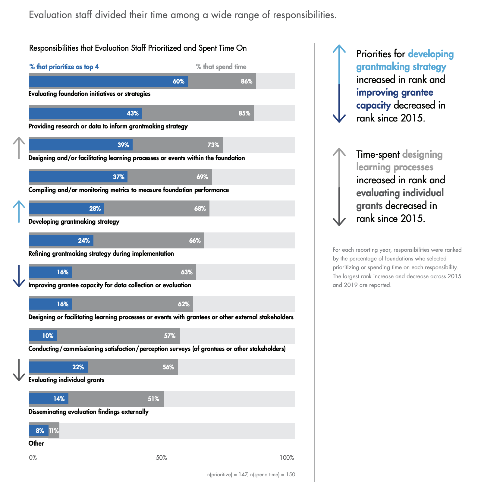
Rad Resource: Check out our hot-off-the-press report, Benchmarking Foundation Evaluation Practices 2020. It offers a window into current foundation practice around evaluation and learning. In this blog post, we offer some tips based on our creative process and highlight one visual from the report that compares what foundation evaluation staff prioritized compared to what they spent time on in 2019:

Hot Tip: Iterate often for better analysis and storytelling with your dataviz. Start with some exploratory visuals to get a sense of the data. Using conditional formatting in Excel and developing multiple dataviz versions can help you see key differences or trends in your data.
Here’s the exploratory version of the above visual; there are two types of Excel conditional formatting on the left, helping us observe how the data changed between 2015 and 2019.

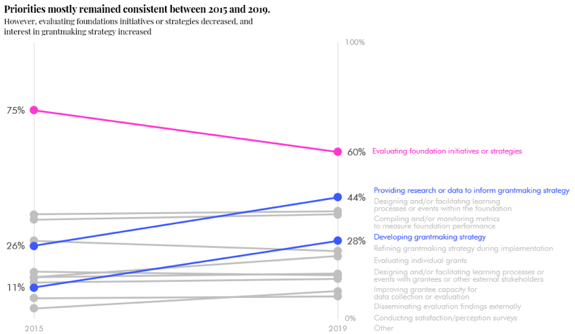
Drafting multiple versions of a dataviz can help you consider what chart type might best tell a story with data; don’t invest all your time on your first visualization idea. Our next draft, a slopegraph, displays percentages rather than rank differences.

We ultimately decided this comparison wasn’t appropriate because the survey questions and answer choices differed across years. In the final version we shared above, we show percentages for 2019 only, and discuss the yearly rank differences in call-outs on the right. By using an overlapping bar chart, we were able to show time spent and priorities simultaneously, adding another point of comparison!
Hot Tip: Gathering multiple perspectives on your dataviz is vital in crafting a comprehensive, powerful report. The working group between CEI and EdgeEval met regularly to discuss analyses, options for visuals, and main takeaways for each chart. Some things that worked for us include:
- Share a draft with your client/thought partner and ask them for the story that jumps out to them. Re-draft and repeat. These conversations hone both the story and the visual that will best display it for your specific audience.
- Ask an outside perspective whether your visual is clear and informative; this will tell you if you are portraying what you intended.
Lessons Learned: The data visualization process takes longer than you expect. Sometimes, when you think you’re done, your client’s perspective, the story the dataviz tells, or the data itself might evolve and you create yet another draft. It’s worth it to get to a dataviz you’re proud of because it is well-designed and tells the story you want to tell.
Rad Resources:
- Data Viz Today podcast and blog: Host Alli Torban shares new techniques and interviews other dataviz rock stars.
- Alberto Cairo, How Charts Lie: A guide to being graphically literate—in your own charts, and in examining others.
We would love to hear what you think about this report—both about the findings and the dataviz! Please tweet at @EdgeEval and @Eval_Innovation using #FndnEvalBench2020.
The American Evaluation Association is celebrating Data Visualization and Reporting (DVR) Week with our colleagues in the DVR Topical Interest Group. The contributions all this week to aea365 come from DVR TIG members. Do you have questions, concerns, kudos, or content to extend this aea365 contribution? Please add them in the comments section for this post on the aea365 webpage so that we may enrich our community of practice. Would you like to submit an aea365 Tip? Please send a note of interest to aea365@eval.org. aea365 is sponsored by the American Evaluation Association and provides a Tip-a-Day by and for evaluators.
