My name is John LaVelle from Louisiana State University. The following is an interactive script developed to help my students and stakeholders inductively discover the value of triangulation. The example is focused on inquiry methods, and can be easily adapted to other forms of triangulation.
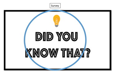
Script: Let’s start from the premise that the inquiry process is supposed to help you (the stakeholder) learn in-depth information about something important. A process, a product, an idea, the possibilities are endless. An educational program, the process of new employee onboarding, clients’ awareness of new services, the aesthetic quality of my shoes, anything. I selected this image to represent that thing:
This image represents the complete truth of a phenomenon, and the borders represent the boundaries of the construct (which can’t really be known). In this example, we will assume that this construct is orthogonal, so there isn’t any overlap between it and other concepts. Assume we are not concerned with funding or politics (yet).
Now we study it with systematic inquiry (blue circle). Let’s call the blue circle a survey, and let’s assume it gets right at the center of the thing we’re studying. Everything within the circle represents increased understanding.
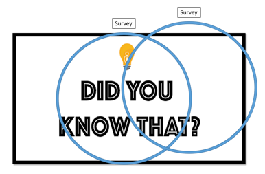
Not too bad, huh? We learned a lot of information about the phenomenon from just one study, and it doesn’t look like we got a lot of information from other concepts involved. Every data collection tool will have some error (or similar concept), and that can lead to challenges later when you try to make sense of things. Now, this survey did a good job, but it does not represent the entirety of the phenomenon. Let’s try another to understand it some more using the same method (survey).
Well, this looks different. Not bad, just different. We learned some new information that helps paint a fuller picture of the phenomenon, and that reinforces some ideas learned from the original study.
Note to facilitator: This can be a place to plant the idea of measurement error by drawing attention to where the circle goes beyond the boundaries of the square.
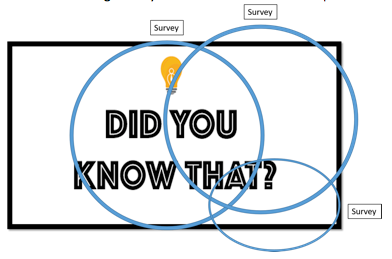
Third time is the charm! It seems like survey methods are painting a robust representation of the construct. Every time we use a survey, we increase the validation and trustworthiness. An observation: our inquiry methods seems to be grouping on the right side of the construct and a rather large region of the phenomenon is unexplored. Could another approach will provide different information and explanation?
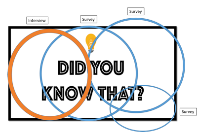
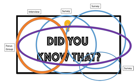
It looks like a different method, such as interviews (orange circle) provided information that helped explain an unexplored region of the construct as well as helped reinforce the first and second studies. That is interesting. We should use at least one more approach to really pull things together, especially if we’re trying to learn about something that has direct implications for someone’s health, functioning, economic status, etc.
Now things are really starting to pull together. The central aspects of the construct were reinforced through five examinations using three methods, so it looks like the data are trustworthy and seem to be telling a reasonably consistent story. Excellent work!
This was a lot of information, and there are some important implications here. What could happen if:
- You are only familiar with one approach to answering questions?
- Your stakeholder(s) value one kind of information (quantitative or qualitative) over another?
- Money for the study or evaluation is a concern? How will you prioritize?
- One kind of data is more expensive to collect and analyze than another?
- The inquiry methods aren’t well-refined?
Do you have questions, concerns, kudos, or content to extend this aea365 contribution? Please add them in the comments section for this post on the aea365 webpage so that we may enrich our community of practice. Would you like to submit an aea365 Tip? Please send a note of interest to aea365@eval.org . aea365 is sponsored by the American Evaluation Association and provides a Tip-a-Day by and for evaluators.


Great visuals. They really drive your point home. Thanks for the info!
Fantastic way to explain this, John – thanks for posting!
If this series of images is helpful to anyone, I’m happy to share the powerpoint I used to create the graphics. email: JLavelle@lsu.edu