My name is Dan McDonnell, and I am a Community Manager at the American Evaluation Association.
For many people (myself included), the smartphone has become an extension of ourselves. We use our ‘third limb’ for nearly everything these days: from accessing news on our RSS feeds, to checking banking statements, to finding the perfect sushi spot within walking distance from the office.
With more and more people accessing the web from their mobile devices every day, evaluating your website or blog to measure mobile traffic and ensure a positive user experience is of utmost importance. By creating an engaging experience on mobile and removing barriers to entry, you make strides toward winning the battle for attention in a world filled with endless distractions and legions of multi-taskers.
Hot Tip: Google Analytics – Mobile Tab
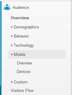
The first place to start is with the free web measurement tool, Google Analytics. Once you’ve logged into your profile, under ‘Traffic Sources’ on the left sidebar you’ll see the ‘Mobile’ tab. Using the information under ‘Overview’ will help you better understand how many of your visitors are accessing the website on a desktop, mobile or tablet device.

Pages per visit and time spent on page will give you greater insight as to the behavior on the site. Often, you’ll find that desktop users spend the most time on a particular webpage, followed by tablet users, followed by mobile users. Knowledge of how visitors engage with specific pages on your website can help you craft a better user experience, and identify where fresh or optimized content can lead to improvements and increases in traffic.
Quick Metrics Guide:
- Pages per visit: How many pages are visitors viewing during a single visit to the site (mobile vs. desktop vs. tablet)
- Bounce rate: Are mobile users leaving the site without viewing other pages?
- Time on site: How long do visitors spend on your mobile or tablet site? What about on your desktop site?
Rad Resources: DudaMobile

What if you have no mobile website? DudaMobile can help you there. Their baseline plan is free, and allows you to create and configure a handful of mobile pages for your site. You’ll be able to view a mocked-up version of your mobile site as you adjust the layout and options to deliver the best user experience. Add buttons to your page, tweak the colors – no knowledge of coding is necessary.
Once your new mobile site is live, continue to measure your traffic and engagement. Don’t be surprised if you see a spike in activity!
Do you have questions, concerns, kudos, or content to extend this aea365 contribution? Please add them in the comments section for this post on the aea365 webpage so that we may enrich our community of practice. Would you like to submit an aea365 Tip? Please send a note of interest to aea365@eval.org. aea365 is sponsored by the American Evaluation Association and provides a Tip-a-Day by and for evaluators.
