Hi, everyone. This is Paul Frankel, and I am an evaluator at Centerstone’s Research Institute. Our division closes the research-to-practice gap for our community mental health centers in Tennessee, Indiana, Illinois, and Florida. I received my doctorate in social psychology from Tulane University, and I was thrilled to attend AEA’s annual meeting in the Big Easy.
I have belonged to AEA since 2003, and I have struggled with stakeholder resistance to evaluation. How can we encourage social workers, therapists, and program administrators to be more invested/interested/engaged in evaluation?
Hot Tips
Visual: Acuity
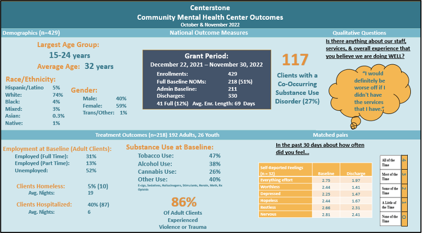
The greatest risk is not taking one, and so I like to experiment with creative ways to get stakeholders’ attention using testimonials, dashboards, and “data bites.” One valuable strategy employs preened data visualizations that are BOLD. Here’s an example of a dashboard that we customized for program staff. Special [data] orders don’t upset us!

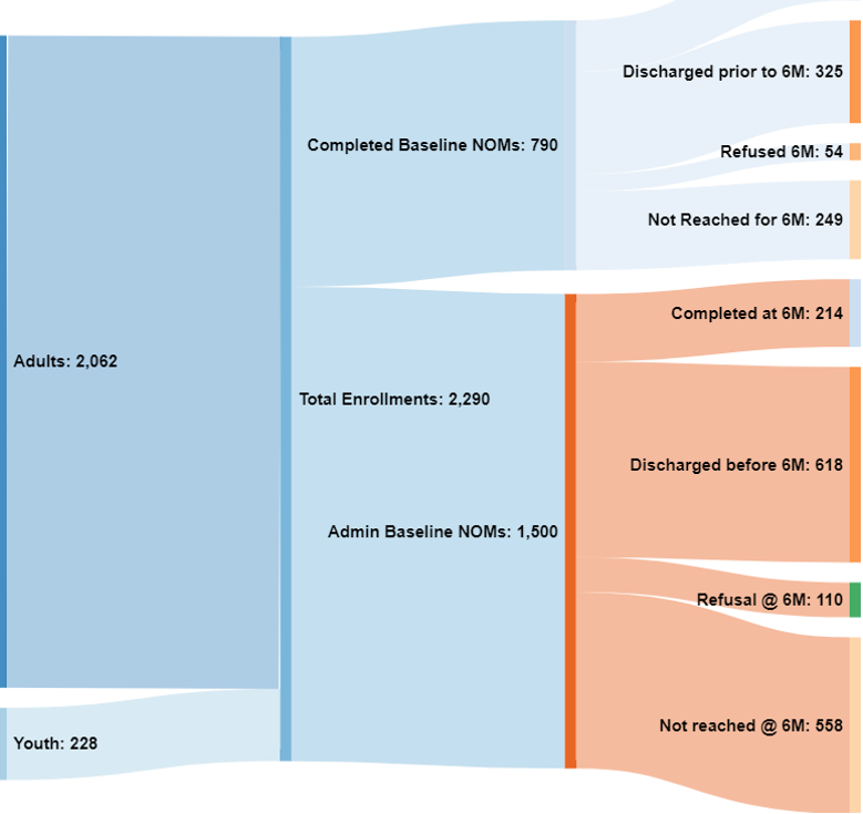
Where did all of our clients go? Here’s a Sankey diagram depicting the flow of clients in a SAMHSA-funded integrated health project. This type of visual portrayal helped providers see that a portion of clients were lost to follow-up (i.e., discharged early, refused treatment, etc.).

Rethinking Value
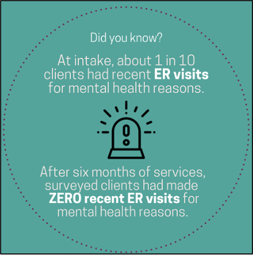
What really matters the most to stakeholders? It’s incredibly important to have multiple conversations and debates with our primary intended users about what information is most valuable. For example, in this chocolate-box data bite (byte?) we determined that a reduction in the use of a costly emergency department for mental health concerns was the most important outcome for an agency.

Rad Resources
- Several of us at Centerstone have enrolled in Depict Data Studio’s Powerful Presentations, and it is well worth the investment. Let’s move beyond the dusty reporting format that is used for theses and dissertations, and that often ends up as a doorstop or as a coaster.
- While at AEA in New Orleans, a co-worker and I participated in a people-friendly Power BI workshop facilitated by Travers Data. We practiced designing a dashboard, transforming our data, and branding/marketing. I am excited to publish and share our reports, and our funders are duly impressed.
- Evaluators must “rumble fearlessly and awkwardly” (in the words Brené Brown) to have iterative discussions to get to the heart of the matter – what are the most important and useful data bits and bytes that affect program change.
- Lastly, if ever you find yourself in a dark place where you must conduct a cost-inclusive, cost-effectiveness, or cost-benefit analysis to monetize the merit, worth, or significance of a program in dollars and sense, be sure to consult Brian Yates, who conducted an interactive presentation at AEA this year to teach us about costing from multiple perspectives.
We are human, after all, and are prone to a multitude of cultural, linguistic, attribution, confirmation, and selection biases, especially when we choose what specific data to highlight for stakeholders – particularly when those stakeholders are funders. It’s a tough but rewarding vocation. As Eva the Evaluator has taught us, being an evaluator can be an adventure requiring the tools of a doctor, carpenter, counselor, journalist, scientist, math teacher, judge, detective, explorer and, of course, superhero.

Laissez les bons temps rouler.
The American Evaluation Association is hosting Behavioral Health (BH) TIG Week with our colleagues in Behavioral Health Topical Interest Group. The contributions all this week to aea365 come from our BH TIG members. Do you have questions, concerns, kudos, or content to extend this aea365 contribution? Please add them in the comments section for this post on the aea365 webpage so that we may enrich our community of practice. Would you like to submit an aea365 Tip? Please send a note of interest to aea365@eval.org. aea365 is sponsored by the American Evaluation Association and provides a Tip-a-Day by and for evaluators. The views and opinions expressed on the AEA365 blog are solely those of the original authors and other contributors. These views and opinions do not necessarily represent those of the American Evaluation Association, and/or any/all contributors to this site.

+100 points for using a Sankey diagram to visualize the flow, rather than trying to just shove everything into a pie or bar chart (which have different uses entirely). Go Paul go! 🙂