Hello, AEA365 community! Liz DiLuzio here, Lead Curator of the blog. This week is Individuals Week, which means we take a break from our themed weeks and spotlight the Hot Tips, Cool Tricks, Rad Resources and Lessons Learned from any evaluator interested in sharing. Would you like to contribute to future individuals weeks? Email me at AEA365@eval.org with an idea or a draft and we will make it happen.
Hello, I’m Rose Konecky, Evaluation and Learning Consultant at TCC Group. I’m here to turn you into a creator of visualization masterpieces. Really!
As evaluators, we always have a story to tell, but we sometimes limit ourselves to words (which, of course, are important) and canned chart creators (also important!). I’m here to show you that we can leverage so much more visual storytelling power than that if we use innovative design principles. And don’t worry – a lack of artistic talent won’t stand in your way. In fact, the technique I’m about to describe is more of a science than an art. It is called the Cartesian Grid System, and you can leverage it with or without talent. All you need to do is follow five concrete steps.
This tactic will benefit both evaluators and their clients by ensuring that the data they work hard to gather doesn’t land with a thud. Instead, it will unite a presentation’s elements and speak clearly to an intended audience. When presenting evaluation data, we tend to lean heavily on displaying charts and tables and then augmenting them with descriptive text. But you will be able to tell a story more effectively to your audience if instead of using that tactic, you weave in these key elements of visual design. It also has the added benefit of increasing accessibility, reaching individuals who learn best in different ways.
With increased proficiency in the system, you can use data, words, and images to tell a story, or even call your audience to action.
Hot Tip
Here’s how you can bring structure and balance to your visual communication.
- Start with a sheet. This technique requires nothing more than a blank PowerPoint slide – or even a blank sheet of paper.
- Add margins. Designate a space along the border of your slide where you cannot put any content. Reserving white space here gives the reader’s eyes an opportunity to rest.
- Add an erasable (or delete-able) grid. If you’re working in PowerPoint, draw or paste in light gray grid lines spanning the free space. It should have (approximately) 12 columns, 6 rows, and “gutters” in between. You can create it on your own or use the linked YouTube video to walk you through it. It will look something like this:

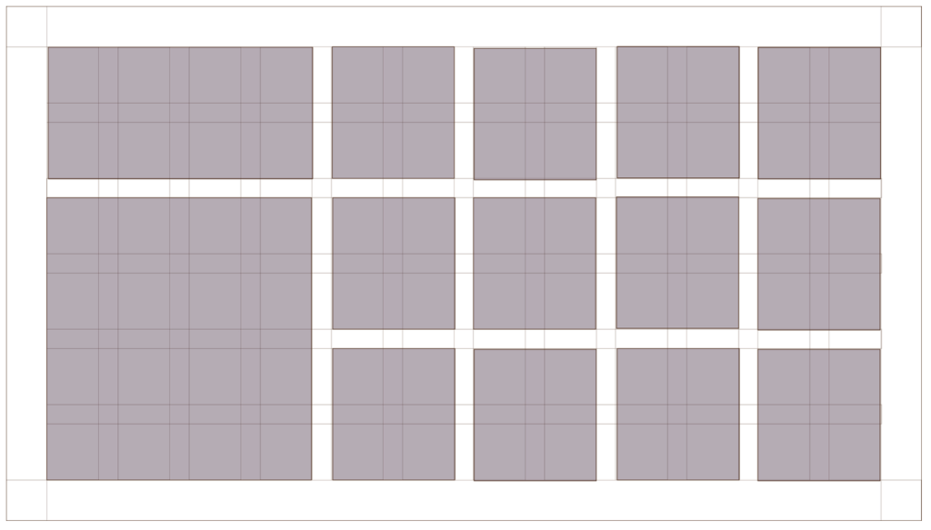
4. Fill the open squares. Now comes the fun part – content. Your job is to fill the free spaces with key elements, in whatever permutation you’d like. The only rule is not to stop in the middle of a gutter. See an example below where I decided the location of example content.

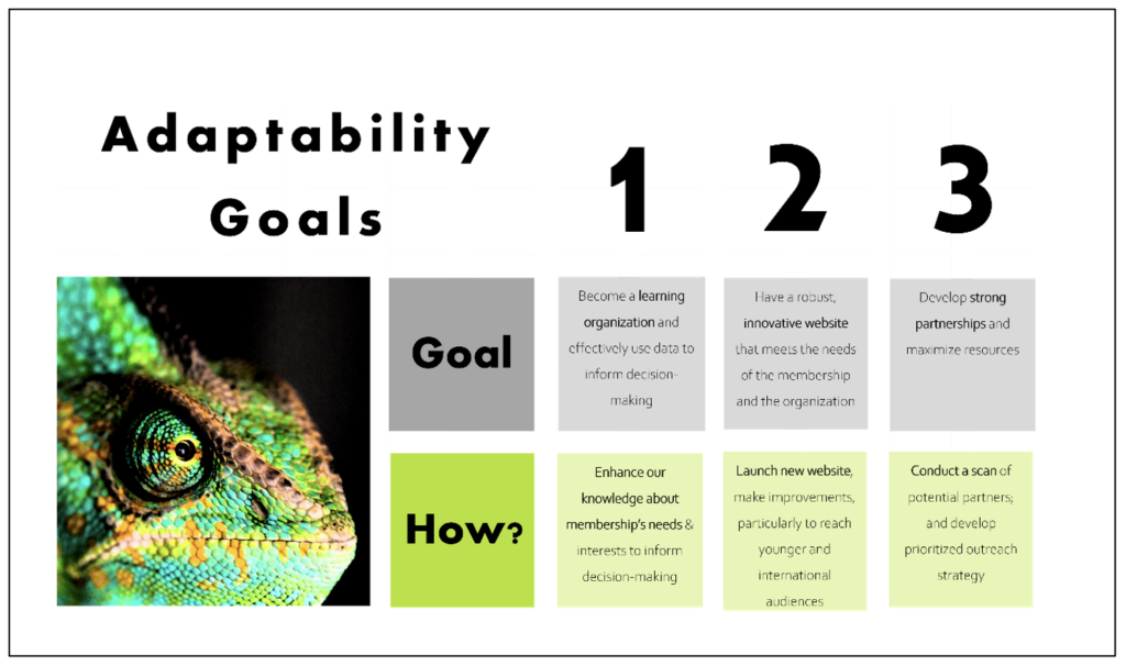
5. Delete the grid itself. You will be left with a balanced and bold presentation that dazzles the eye. Below is an example of a slide where I adapted a text-only slide using the grid system.

Lessons Learned
- There are few barriers to use. All you need is an understanding of Microsoft Office programs and something to say! You are ready to make your findings into art.
- Break the rules sometimes! The only “rule” above was no content in the gutters. But even that rule can be broken once in a while. In fact, it might result in something equally striking, which would stand apart from previous slides and add visual spice to a presentation.
It’s clear that I’m passionate about PowerPoint, and I look forward to speaking in person with you about it at the American Evaluation Association poster exhibition session on Wednesday, October 11. It will be really impactful to show rather than tell about this technique and even workshop slides in real-time with audience examples. In the meantime, reach out to me any time at @rose_k_tcc on Twitter or at rkonecky@tccgrp.com. I’d love to hear your visualization techniques and would love to hear if you will be at the AEA conference.
Rad Resources
- Watch the referenced “How to Create Slide Design with the Grid” video on YouTube.
- Visit Unsplash.com for brilliant and royalty-free images such as the chameleon shown above.
- Visit Coolors if you want a striking color scheme but don’t know where to start.
Do you have questions, concerns, kudos, or content to extend this aea365 contribution? Please add them in the comments section for this post on the aea365 webpage so that we may enrich our community of practice. Would you like to submit an aea365 Tip? Please send a note of interest to aea365@eval.org . aea365 is sponsored by the American Evaluation Association and provides a Tip-a-Day by and for evaluators. The views and opinions expressed on the AEA365 blog are solely those of the original authors and other contributors. These views and opinions do not necessarily represent those of the American Evaluation Association, and/or any/all contributors to this site.
