I’m David Keyes, founder of R for the Rest of Us. In addition to teaching evaluators and others to use R, I also do data visualization work. Before I learned R, I dabbled in data visualization. Now that I use R regularly, I produce a wide range of high-quality data visualization. R has totally transformed my data viz work.
The ggplot2 package that underlies so much high-quality data visualization has been fundamental to my transformation from data viz dabbler to data viz pro. Ggplot relies on the grammar of graphics, a sort of language for describing all plots. One key insight of the grammar of graphics is that certain “aesthetic properties” are used to represent certain aspects of data. So, for example, we might use color (the aesthetic property) to represent higher rates of voter participation, as I did in this map (yes, you can make maps with ggplot!) that is part of the Oregon by the Numbers report, to which I contributed all of the data visualization.

Thinking about my data visualization work in this new, highly structured way helped me to go beyond the hacking of Excel that had been my previous modus operandi. What’s more, I no longer felt like I had to hack other tools to make what I wanted — I now had a blank slate to make anything I could imagine.
Being freed to imagine any type of data visualization is one thing; actually, imaging new data visualizations is quite another. An additional benefit of learning R has been seeing how others use it to make data visualization.
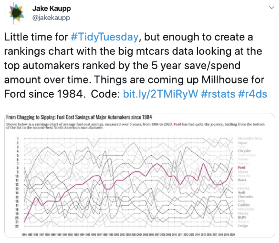
One way I get inspired is by following the Tidy Tuesday project. Described as a “weekly social data project,” Tidy Tuesday participants get a new dataset every week, which they then analyze and visualize. The results that participants share using the #TidyTuesday hashtag on Twitter are inspiring. Every week, I get new ideas. And the best part is people post the code they use to make their visualizations, which makes it easy to make similar work myself.

Through following Tidy Tuesday, I’ve learned about a wide range of visualizations I had never even considered making before learning R. Many use ggplot extensions, such as ggridges (for ridgeline plots), ggbeeswarm (beeswarm plots), ggalluvial (Sankey diagrams), ggwaffle (waffle charts), and many more.
Switching to R has taken me from data viz dabbler to data viz pro. I always liked making data visualization, but now I have the theoretical understanding, the inspiration, and the tools to do consistently high-quality work. Learning R was challenging, but the payoff has been worth it.
Rad Resources: There are many places to learn about data visualization in R, but I tend to push people to two recently-released books on the topic. Data Visualization: A Practical Introduction by Kieran Healy and Fundamentals of Data Visualization by Claus Wilke are excellent introductions to data visualization in R — and they’re both available for free.
The American Evaluation Association is celebrating Data Visualization and Reporting (DVR) Week with our colleagues in the DVR Topical Interest Group. The contributions all this week to aea365 come from DVR TIG members. Do you have questions, concerns, kudos, or content to extend this aea365 contribution? Please add them in the comments section for this post on the aea365 webpage so that we may enrich our community of practice. Would you like to submit an aea365 Tip? Please send a note of interest to aea365@eval.org. aea365 is sponsored by the American Evaluation Association and provides a Tip-a-Day by and for evaluators.
