Hey there, I’m Echo Rivera, owner of Creative Research Communications, LLC and advisory team member of AEA’s Potent Presentations Initiative (p2i).
I love Twitter, and have been tweeting since 2012. I’m here to help your tweets stand out from the crowd. And by “crowd,” I mean the estimated 500 million tweets sent per day. The easiest way to do that? Add a great visual.
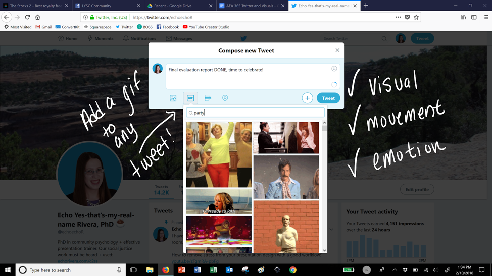
Hot Tip: The easiest way to do this is to add a gif to your tweet. Gifs are magical little visuals because they hit the sweet spot of (a) being a visual, (b) having movement, and (c) showing an emotion.
When you want to tweet about something you created (e.g., report, blog post), then I recommend you create your own visual. Spend some time creating your own design style or brand, so you establish consistency across your images. Create a template so all you have to do is change the wording and/or a photo.
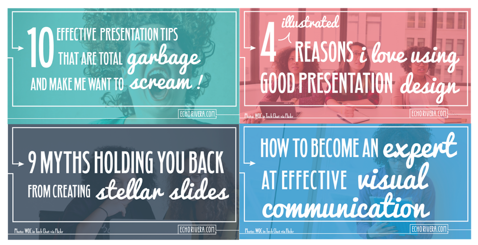
Case Study: Here is the twitter template I use for my blog posts. I created a canvas that follows the Twitter dimensions (which change over time, so I just Google it first). I use fonts in a similar way, place the same type of info (e.g., title, photo attribution) in the same place, and alternate between my 4 branding colors (which are transparent shapes so the text is easy to read). I use photos of real people, and I try to match the emotion to the title as much as I can.
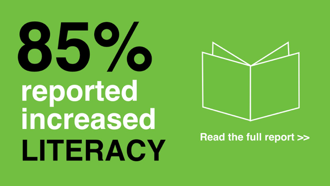
Rad Resource: You probably already have the software you need to make visuals: PowerPoint or Keynote! The above visuals were made using Adobe Illustrator, and you could use something just as specialized. But I learned how to make visuals using shapes in Keynote. Simply (1) choose a 16:9 slide size (or custom size, if you want); (2) use shapes (or icons you find online) and multiple text boxes to create the design you want; and (3) export that slide as an image. That’s how I made this and it took me about 2 minutes (and if you want this slide to copy, see below!):
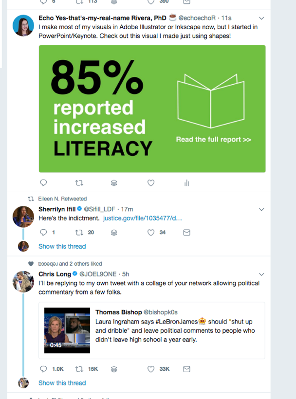
The slide dimensions don’t adhere to the Twitter specifications exactly, but because it’s widescreen it still fits well. Here is what it looked like when I tweeted it. Which of the following tweets do you think was the most eye catching (hint: it’s this tweet)?
Rad Resources:
- Get the Powerpoint or Keynote literacy template, here. Feel free to copy/paste to fit with your evaluation topics!
- For ideas on how to create a consistent style/brand, check out Ann K. Emery & Denise Roosendaal’s AEA 365 post here.
- This may sound surprising, but the skills involved with creating Twitter visuals are the same skills involved with creating visual presentations. Bonus! If you’re tweeting about a presentation, then you can export your visual slides and use them as a twitter visual! To work on your slide design skills, check out my free course: Countdown to Stellar Slides.
The American Evaluation Association is celebrating #EvalTwitter week. All posts this week are contributed by evaluators engaging, networking, and collaborating through Twitter. Do you have questions, concerns, kudos, or content to extend this aea365 contribution? Please add them in the comments section for this post on the aea365 webpage so that we may enrich our community of practice. Would you like to submit an aea365 Tip? Please send a note of interest to aea365@eval.org . aea365 is sponsored by the American Evaluation Association and provides a Tip-a-Day by and for evaluators.


