I’m Wendy Tackett, the president of iEval, sometimes faculty member at Western Michigan University, and lifelong Disney fan!
Lessons Learned: You never know where you’re going to run into inspiration for your evaluation work, so keep your eyes, ears, and mind open. In 2015, I went to the D23 Expo in Anaheim, California. I went purely for myself, since I love Disney everything, and I never dreamed I would learn something that could be applicable to my evaluation practice.
In a session with the Pixar team, I learned about a technique created by Ralph Eggleston called color scripting. Color scripting is a type of story boarding, but Ralph would change the main colors of each panel to reflect the emotion the animated film was supposed to portray at that time. It helped the Pixar team understand what was going on in the film emotionally, and it also made it easier to create a musical score to enhance those emotions.
A few days later, I was taking notes on the engagement and enthusiasm of a large audience. I created some metrics on the spot including number of people on their mobile devices, number of people leaving the event, murmuring, applause, etc. Then inspiration hit me, and I used the color scripting idea to create a timeline of the event, highlighting who was presenting at different times, and coloring the data. The client felt it was an extremely useful overview of how the audience related to the event and the discussion that ensued really helped them figure out how to change the event for the next time.
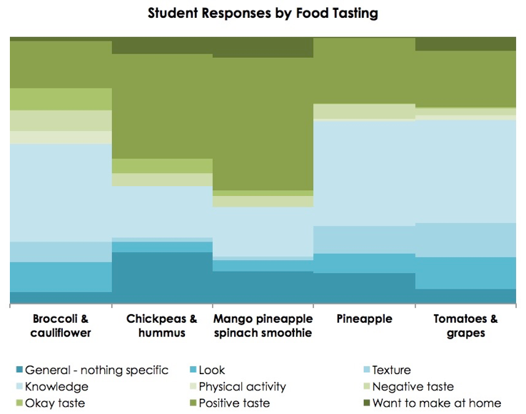
Since then, my adaptation of color scripting has evolved, and my team has used it on different projects including professional development training, farmer’s markets, nutrition lessons, etc. Recently, we asked K-6th grade students what they learned at the end of each nutrition lesson, then analyzed the data by lesson topic, grade levels, and topic order. These graphs resulted in thoughtful conversations with the nutrition educators about what students think, the impact of specific lessons, and the progression of lessons. The color scripting graphs visually indicated the percentage of students expressing changes in knowledge (blues, the darker the blue – the more substantial the knowledge) or behavior (greens, the darker the green – the more substantial the behavior).
Hot Tip: When you learn (or create!) a new technique, try applying it in different contexts to 1) practice using it, 2) identify where it’s most meaningful in analyzing data, and 3) determine various ways clients will be able to use it.
 Rad Resource: If you missed my presentation at AEA 2017 on Color Scripting and would like to download it, you can grab it and other presentations at iEval’s web site. In the presentation, there are detailed examples of how you can use Color Scripting. You can also grab the step-by-step directions on how to do Color Scripting!
Do you have questions, concerns, kudos, or content to extend this aea365 contribution? Please add them in the comments section for this post on the aea365 webpage so that we may enrich our community of practice. Would you like to submit an aea365 Tip? Please send a note of interest to aea365@eval.org . aea365 is sponsored by the American Evaluation Association and provides a Tip-a-Day by and for evaluators.


Thanks for posting this, Wendy! I wanted to attend your session at AEA but was unable to. So I’m glad you posted this to allow access to the materials. Many thanks again
I’m glad you’re able to access the information, and I hope you find it useful!
Wendy what an innovative idea! How quickly do you find your audiences understood and were able to interpret your visualizations?
Thanks, Jenny! So far the different groups we have used this with have all grabbed on to it very quickly. Some of the specific “likes” about the visual included 1) easy to compare across different groups (e.g., elementary vs middle, group 1 vs group 2) and 2) quickly see high points and struggling areas in the understanding of materials.