Hey there! I’m Johanna Morariu, a Director of Innovation Network and the Co-Chair of the DVRTIG. DVR is the Data Visualization and Reporting TIG, and we work within the AEA community and through our evaluation work to improve the quality of communications through better data visualization and improved approaches to reporting evaluation findings.
You could say the first DVRTIG meeting was in 2010, when Stephanie Evergreen convened a small, rowdy group of us to discuss interest in founding the a new TIG to advance issues related to data and information design and reporting within the evaluation community. Since then, we’ve been a fast growing TIG with more than 800 members. (Thanks Stephanie!)
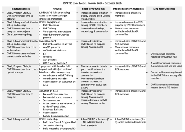
Since those earliest days, TIG members and leaders have worked hard to develop a knowledge and resource base for members and the broader AEA community. One of those newest resources that we’d like to share is a DVRTIG logic model. Yes, our very own logic model!
Rad Resource: The DVRTIG Logic Model was developed by DVRTIG leadership coming out of the Evaluation 2013 DVRTIG business meeting. The logic model reflects the ideas and ambitions suggested by TIG members at the business meeting. There are more activities than we can hope to achieve, but this is our record of ideas and possibilities for the TIG for the next two years. Check it out and leave a comment in the AEA resource library.
Rad Resource: Another great resource if you’re interested in learning more about the DVRTIG is our website. Anne Worthington is our TIG webmaster and maintains an excellent resources hub of dataviz resources, DVRTIG videos and content, and much more!
Hot Tip: Did you know there is a forum for chatting directly with AEA members interested in data visualization and reporting? Through the DVRTIG website, you can access the DVRTIG eGroup to start a conversation, get feedback on your visualization or report, or share new resources!
We’ve got a great week of posts lined up for you! First, Ann Emery (my colleague at Innovation Network and DVRTIG Co-Chair) will wow you with some stats and visualizations about the DVRTIG. Up next will be Rakesh Mohan and his colleagues from Idaho State’s Office of Performance Evaluations to explain Sankey diagrams. Then we’ll hear from Tony Fujs of the Latin American Youth Center about using R and ggplot2 for data visualization. From there we’ll turn it over to Gretchen Biesecker, Vice President of Evaluation at City Year, to explore storytelling as an effective communication method. And we’ll wrap up the DVR week with Ann Emery and Stephanie Evergreen with a test drive of their Data Visualization Checklist.
The American Evaluation Association is celebrating Data Visualization and Reporting (DVR) Week with our colleagues in the DVR Topical Interest Group. The contributions all this week to aea365 come from DVR TIG members. Do you have questions, concerns, kudos, or content to extend this aea365 contribution? Please add them in the comments section for this post on the aea365 webpage so that we may enrich our community of practice. Would you like to submit an aea365 Tip? Please send a note of interest to aea365@eval.org. aea365 is sponsored by the American Evaluation Association and provides a Tip-a-Day by and for evaluators.


Nice post, Johanna. I really like the graphic — vivid colors, simple but eye catching.
Actually I’m going to disagree with myself. On further reflection, I don’t think the viewer ‘reads’ a thousand words, I think the viewer ‘creates’ a thousand words – and given the creative process the obligations on the visual representation just get that much harder. In effect the visuals are metaphors and like all metaphors their range of interpretations can generate a false sense of agreement over meaning.
I really support what DVOP is seeking to do, but what you make more visual is as important as how you make it more visual. Take the role of visualization in Theories of Change. A recent report by the UK’s Department of International Development (the rough equivalent of USAID) surveyed what had been written about the necessary components of a Theory of Change. The conclusion was that a ToC represented a discussion of five key components of a ‘theory’; context, result, process, assumptions and ‘a visual representation that captures the outcomes of the discussion’. Note those last three words, not outcomes of the intervention but outcomes of the discussion of the ToC. Now look back at the visualisation that you supplied as you TIG’s ToC … how much does it reflect any discussions you had on the context, change, process and assumptions?
One of the great advantages of more creative use of visuals is that it allows the addition of things commonly left out of more traditional means of expression. Like the ‘Rich Picturing’ tradition in the systems field for instance, which includes structures, processes, conflicts, stakeholders, stakes, motivations, values, norms, agreements, goals, aspirations, culture and so on.
A picture doesn’t speak a thousand words, the viewer reads a thousand words. And since they cannot read you mind, the viewer must have the opportunity to read as comprehensive, valid and accurate representation of your mind as possible.