Hi! I’m Sarah Dunifon, Research and Evaluation Associate at the Wildlife Conservation Society (WCS). In my role, I create many reports and I’m always looking for efficient tools for data visualization. I’ve found a few different programs to display location data, which I’d like to share with the wider AEA community.
Rad Resources:
Google Fusion Tables is an experimental app add-on that you can link to Google Drive. It allows users to create online, interactive heat maps and feature maps. Privacy settings are managed in the same way as other Google products where users can decide on a range between public and only available to you as the user. Viewers can manipulate the maps in various ways, such as filtering results, scrolling around the map view, or switching between map types.

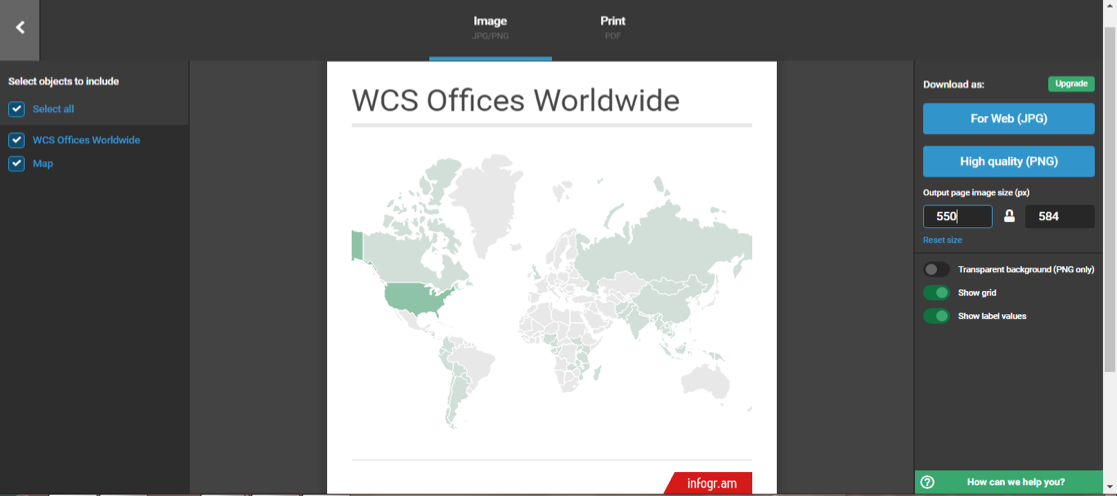
Infogr.am offers quick and easy interactive heat maps which can be shared via weblink. The free version includes a United States map and a world map, and your data will be public, whereas the paid versions have data privacy, more map choices, and the option to download the maps as images.

Excel Apps – Geographic Heat Map
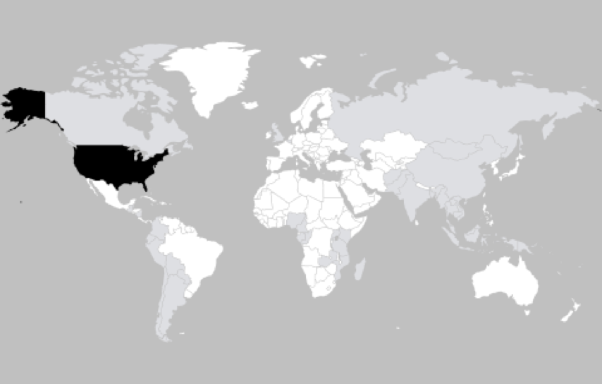
With the “Geographic Heat Map” app on Microsoft Excel, you can create either a world or United States heat map. The data is private and you can save your final map as a picture, making it a good option for inserting into a report. This app doesn’t have much customizability in color and style, but I’ve been able to paste the image into another program (say Microsoft Word or PowerPoint) and edit the image there.

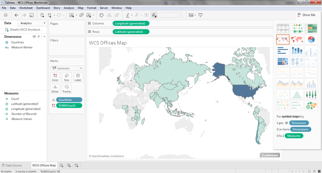
Tableau offers feature maps and heat maps for free, though the data will be public. This program is highly customizable and makes some beautiful visualizations. However, you might find there is a bit of a learning curve to using this software. The visualizations can be saved as an interactive display in “presentation mode” or uploaded to the Tableau Public gallery where they can be shared digitally.

Excel Powermap
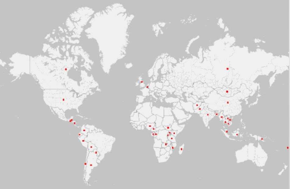
Powermap in Microsoft Excel lets you create private feature maps in a variety of themes on a 3D globe. The map can be an online interactive display or an image produced by taking a screen grab through the program. The screengrab puts a picture of the image onto clipboard, which you can then paste into another program.

Hot Tip: Consider how you intend to use the map before you start building it. If it needs to be interactive, choose an online format. If it needs to be put into a report, pick a program with capabilities to export a high-resolution image, rather than just a screenshot.
Do you have questions, concerns, kudos, or content to extend this aea365 contribution? Please add them in the comments section for this post on the aea365 webpage so that we may enrich our community of practice. Would you like to submit an aea365 Tip? Please send a note of interest to aea365@eval.org . aea365 is sponsored by the American Evaluation Association and provides a Tip-a-Day by and for evaluators.

Nice Post
Sarah (and all),
Thank you for sharing your mapping tips. It’s good to see the variety of options that are available and to add to my professional list.
Has anyone in the group gone a step beyond Excel power mapping? I’ve used ESRI’s programs before but I don’t think I can afford them in my current agency. I’d love to be able to use multiple data points and layers to inform our services and programs. Is there software in-between those two?
Thanks in advance for any insight you can provide!
Kim
Thanks Sarah!
The Dataviz Catalogue also has great resources for maps:
http://www.datavizcatalogue.com/methods/choropleth.html
http://www.datavizcatalogue.com/methods/dot_map.html
http://www.datavizcatalogue.com/methods/bubble_map.html