My name is Meredith Haaf and I work for the Evaluation Studies Unit in the Faculty of Medicine at the University of British Columbia. I used the p2i poster guidelines to create a conference poster illustrating the findings of an evaluation.
Although I had some ideas for creating effective presentations, I wanted to learn new strategies to make this poster stand out in the right way.
Rad Resources: The poster guidelines provide an overview of suggestions for creating an effective poster. Topics include font size, language use, and choice of colour and graphics. It was a great resource to use as a starting point and for reference during the editing stages.
This How-to Guide uses visuals in a step-by-step guide to revamping research posters. It helped me to apply the poster guidelines with easy-to-follow instructions for reducing the amount of text, adding graphics, choosing colour schemes, and more.
Before
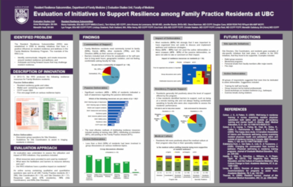
The first iteration of my poster used a solid dark background and white text. The charts included all of the survey items related to a given topic, in addition to call-out boxes containing qualitative data. The choice of colours made it difficult to distinguish between the charts and the background (e.g., blue on blue). Moreover, the large amount of text and data seemed difficult for the reader to digest in a short amount of time. The images are intentionally blurry to mask our data, but you can still get the gist of the layout.
After
After reviewing the p2i resources, I realized it was possible to greatly reduce the amount of data presented, while still effectively communicating the results of the evaluation.
I reduced the number of survey items presented in each section, focusing only on those directly related to my key message. I also summarized the findings in bullet points. Having less text allowed me to increase the size of the graphics and the amount of white space.
The p2i poster examples showed me that a light-coloured background with dark text and brightly coloured graphics are more easily viewed from a distance (i.e., higher contrast). My new poster used white columns with a solid grey background to emphasize the charts and tables:
Lesson Learned: The most important take-home message I gathered from the p2i resources on poster presentations is to “keep it simple”. Your poster does not need to illustrate all findings related to a particular project; rather, ensure you are presenting key findings in the most clear and engaging manner. Your audience will appreciate being able to easily grasp the basis of your project, and any further questions can be addressed by you during the poster presentation or in follow-up communications!
The American Evaluation Association is celebrating p2i Week with AEA members who have used our Potent Presentations Initiative. The contributions all this week to aea365 come from members who have used p2i strategies in their presentations. Do you have questions, concerns, kudos, or content to extend this aea365 contribution? Please add them in the comments section for this post on the aea365 webpage so that we may enrich our community of practice. Would you like to submit an aea365 Tip? Please send a note of interest to aea365@eval.org. aea365 is sponsored by the American Evaluation Association and provides a Tip-a-Day by and for evaluators.


