Hello evaluation folks! I am Laura Beals, Director of Evaluation at Jewish Family and Children’s Service, a large multi-service nonprofit in Waltham, MA. Last year was my first AEA annual conference and I was fortunate to be able to present. As I was preparing my presentation, I was alerted to p2i resources; while at first I was (admittedly) not quite sure how to apply some of the tips, they have been instrumental in how I have improved my presentation style.
Hot Tips:
- One of my favorite p2i tips is to state your key take-aways at the beginning of the presentation, as described in the “Messaging” tutorial on the p2i homepage. Lately, especially when I am presenting evaluation findings and I want an audience-driven discussion, I also state upfront what I am asking of people (e.g., “I will be asking you to provide me feedback on the methodology”).
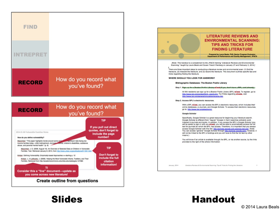
- My second favorite p2i tip is that handouts do not have to be printouts of your slides; in fact, handouts should be created separately to complement the presentation. Once I mentally separated the presentation from the handouts, I found myself having more freedom in my slides, since I knew they didn’t have to be understood out of the context of the presentation. For example, below is a side-by-side comparison of two slides and the handout from a literature review training I gave at my agency:
- I will be honest—presentations that are primarily visual take time to prepare, so allot extra time, especially when you are first learning. It has taken time and practice for me to undo the default “bulleted PowerPoint style.” While now I can more easily envision a visual presentation from the outset, I often have to make my presentation the “old-school” way (bullets) to start, which then serves as an outline of what content I want to make sure to address on each slide. Then, I go through each slide and think about the key take-away and how I can present it visually instead.
- If you are feeling stuck about how to design your slides, poster, or handout, be inspired by others! I recently listened to a NPR TED Radio Hour show on Originality—in it the guests reflected on how we borrow ideas from others. I find that when I am stuck with where to begin, I like to use others’ as inspiration (and I stress “inspiration”—be respectful of the copyrights of other artists—only use materials that are released for re-use and always attribute!). For example, I love COLOURlovers for color palettes and I have been inspired by Stephanie Evergreen’s “rule of thirds” template and the “Fab Five” reboots on the p2i website.
The American Evaluation Association is celebrating p2i Week with AEA members who have used our Potent Presentations Initiative. The contributions all this week to aea365 come from members who have used p2i strategies in their presentations. Do you have questions, concerns, kudos, or content to extend this aea365 contribution? Please add them in the comments section for this post on the aea365 webpage so that we may enrich our community of practice. Would you like to submit an aea365 Tip? Please send a note of interest to aea365@eval.org. aea365 is sponsored by the American Evaluation Association and provides a Tip-a-Day by and for evaluators.

