Happy Saturday folks! Liz Zadnik here and today we’re focusing on creating accessible content. I am pretty passionate about accessibility – thanks to some brilliant and even more passionate colleagues – and believe as social change agents, advocates for marginalized communities, and professionals seeking to elevate unheard voices we have a commitment to making sure our good work reaches as many as possible.
Hot Tips:
- Make sure the background and font are highly contrasted. The ideal is a white background and black font. Be mindful of images and graphs as well – make sure labels and text within the graph are clearly contrasted against any color.
- Don’t be afraid of large font size! The days of small tight text are gone. Keep your font size larger than or equivalent to Times New Roman at 12-point size. It is also recommended that you adjust line spacing to about 1.15 to leave spacing not only between lines of text, but also paragraphs.
- Keep layout and design consistent throughout your different publications (e.g. reports, briefs, executive summaries, presentations, etc.) Templates assist in helping readers know what to expect and support comprehension.
- Align text along the left – avoid right-justified, justified, or centered text. Centered text may work for titles or some headings. Bulleted lists are also very helpful.
- Use active and personal language, such as “we” or “you,” to help focus the reader and your writing.
Lesson Learned: Accessibility is about more than compliance or regulations – we are trying to engage community stakeholders or organizations in meaningful ways. Each of us bring personal strengths and challenges; there are a multitude of learning styles and abilities, reading comprehension levels, and physical abilities. For example, I wear glasses when driving to be able to clearly see objects in the distance and read signage. Creating accessible content removes the stress of squinting or saving the document “for later” due to the need for more time to read it.
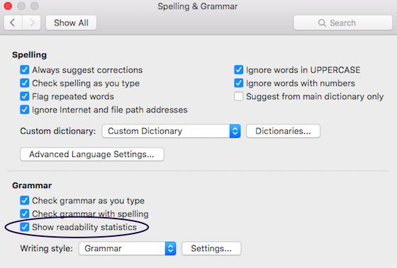
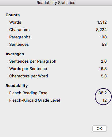
 Rad Resource: Word readability statistics helps determine content’s reading level. Reading levels and literacy of the general public have been found to be at about the seventh- or eighth-grade levels. Plain language is not about “dumbing down” content (a term I find incredibly offensive) – it’s about meeting people where they are and making sure information is available to everyone it can benefit.
 Rad Resource: Not only can you check the readability of content, but Adobe has an Accessibility Check function that reviews the document for high contrast, flow of document, image labels, and other elements of accessibility. The Accessibility report offers specifics for edits and specific content to revise.
Do you have questions, concerns, kudos, or content to extend this aea365 contribution? Please add them in the comments section for this post on the aea365 webpage so that we may enrich our community of practice. Would you like to submit an aea365 Tip? Please send a note of interest to aea365@eval.org . aea365 is sponsored by the American Evaluation Association and provides a Tip-a-Day by and for evaluators.

In Word, go to File, then Options, and Proofing, select ‘Show Readability Statistics’. Readability statistics should now pop up after the spellcheck is run.
I found the accessibility check section under Tools, but don’t see where it reports the Readability statistics as you have shown above. Is this using Acrobat Pro, and if so, what version?
Excellent post. I didn’t know about the readability statistics, so very helpful. Thanks!