Greetings fellow evaluators! My name is Johanna Morariu and I’m a Director of Innovation Network, a nonprofit consulting firm that builds the evaluation capacity of nonprofit organizations and foundations. I’m also the co-chair of the Data Visualization & Reporting (DVR) Topical Interest Group (TIG) along with Amy Germuth, Stuart Henderson, and David Shellard and the DVR TIG is hosting all this week on aea365.
Hot Tip: Have you heard about treemaps? Treemaps are a relatively new data visualization technique—especially to evaluators. The technique was created in the 1990s by Dr. Ben Shneiderman for mapping computer hard drive usage.
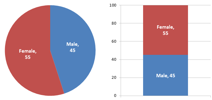
Treemaps are useful for visualizing hierarchical data, or tree structure data. Here’s an example: there are 100 program participants. Of those participants, 55 are female and 45 are male. Using traditional dataviz techniques, the data looks like this:

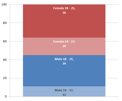
Program participant data may contain additional categories of information, such as age. Keeping with traditional dataviz, the data might look like this:

At this point we have two levels of data. 1) Gender: is the program participant female or male? 2) Age: is the program participant between the ages of 14 – 17 or 18 – 21?
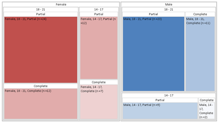
What if we want to add a third level of data to our visualization about attendance? Let’s try a treemap, which is designed for hierarchical data:

Area is used to proportionally illustrate differences in values, i.e., number of participants. The larger a rectangle, the more program participants it represents. Nested rectangles reflect the three levels of data—gender, age, and attendance—so that each level can be analyzed.
For example, the proportion of females to males can be ascertained by looking at the female and male rectangles (the outermost rectangles). Also, within male and female, the proportion of 14 – 17 year olds compared to 18 – 21 year olds can be estimated (first level of nested rectangles). And within those rectangles, the proportion of females and males in each age group who partially attended or completed the program is also represented. In this treemap, color is used to underscore largest vs. smallest values, like a heatmap.
Rad Resources: Wondering how to get started making your own treemaps?
- Learn more about treemaps from Wikipedia
- Check out NewsMap for a pop culture treemap example and some inspiration.
- For beginners, check out the user-friendly ManyEyes.
- For evaluators learning R, Nathan Yau on Flowing Data offers a step-by-step guide for getting started with treemaps in R
Lesson Learned: There are more dataviz options than the usual charts and graphs we’re used to! Varying visualization types is akin to paying attention to varied word choice to keep a reader’s interest. It’s not necessary, but it sure can help!
So, how can you use treemaps? And are there other treemap tools you’d recommend to the AEA community?
aea365 is sponsored by the American Evaluation Association and provides a Tip-a-Day by and for evaluators. AEA is celebrating Data Visualization and Reporting Week. The contributions all this week to aea365 come from members of AEA’s Data Visualization and Reporting Topical Interest Group. Do you have questions, concerns, kudos, or content to extend this aea365 contribution? Please add them in the comments section for this post on the aea365 webpage so that we may enrich our community of practice.

Pingback: Teaching data visualization: Recommended readings and resources
Pingback: | The Dataviz Design Process: 7 Steps for Beginners
Pingback: ASK THE CENTER: How to use data visualization to better tell your story (February 2014 FGN) | Family Giving News
Hi Susan, thanks for mentioning Tableau! Another tool I use is an Excel plug-in developed by Microsoft Research a few years ago. It seems it is no longer publicly available, but it is extremely easy to use. Too bad!
Johanna, thanks for the update on Treemaps! With its newest release, Tableau added a combination treemap/barchart functionality that I find really intriguing but haven’t yet had the opportunity to try it out. More here http://www.tableausoftware.com/public/blog/2013/01/treemap-bar-charts-1797