Hi, my name is Jennifer Bain, and I am an Evaluation Consultant. This post contains a couple of basic tips regarding data visualization I picked up and how to easily apply these tips to your Excel charts without spending a lot of time formatting individual charts.
Lessons Learned: Formatting Visually Appealing Charts
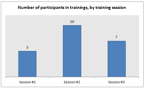
Since I work a lot in Excel and frequently create charts showing programmatic monitoring data, including trends and progress toward estimates and targets, I am always looking for ways to make charts more attractive and easier to interpret. For example
- Horizontal gridlines can be distracting and make a chart too busy.
- Making the plot area gray is easier on the eyes.
- I also like the chart title to have a smaller font size than the default size one used in Excel.
Formatting a chart to my liking was often tedious when I was working with dozens of charts, until I learned how to create chart templates.
Cool Trick: Creating Chart Templates
It’s super easy. You just format a chart the way you like it, and then select the “Save as Template” button on the Design tab of the Excel ribbon that appears under “Chart Tools” when you have selected a chart. A window then appears prompting you to name and save the template.
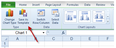
The templates are saved according to the chart type, so you need to save individual templates for the various kinds of line charts and bar charts, etc. For example, if you create a template for a regular column chart and then want to apply the template to a stacked column chart you’ve created, it will convert the chart back to a regular column chart. In that example you would need a separate template for a stacked column chart to be able to automatically apply the formatting.
To apply a saved template you’ve created, simply select “All Chart Types” from the menu that appears when you select a type of chart you’d like to add from the “Insert” tab of the Excel ribbon, and then select the “Templates” folder to access your saved templates.
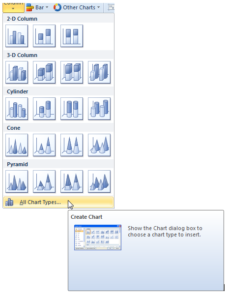
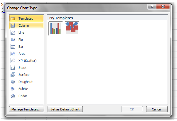
Et voila! This
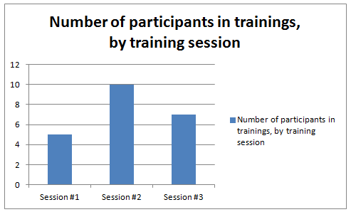
becomes this:
Hot Tip: Using Chart Templates to Automatically Format Other Chart Layout and Formatting Characteristics
You can use chart templates to automate any component of the chart, including
- Whether or not there is a legend. Sometimes, as in this example, a legend is superfluous.
- Whether or not there is vertical axis. Oftentimes eliminating the axis and adding data labels makes charts much easier to read for the audience.
aea365 is sponsored by the American Evaluation Association and provides a Tip-a-Day by and for evaluators. AEA is celebrating Data Visualization and Reporting Week. The contributions all this week to aea365 come from members of AEA’s Data Visualization and Reporting Topical Interest Group. Do you have questions, concerns, kudos, or content to extend this aea365 contribution? Please add them in the comments section for this post on the aea365 webpage so that we may enrich our community of practice.

Hello from a former PopFammer! This trick is going to save me so much time (and headaches). Thanks for the tip1
Glad it was helpful, Chelsey!
another cool tool in excel is the sparklines options. It allows you to make a sparkline that can be pasted in the middle of a paragraph.