Hello, my name is Chris Metzner. I am a graphic and web designer based out of Jacksonville, Florida. I developed and continue to work with the AEA to maintain the p2i Potent Presentations Initiative website.
Most of us want to be better presenters. We are learning about the value of an important message, effective slide designs and powerful delivery techniques through the p2i website, but there is one thing we can learn more about that will take our presentation to the next, next level… a deeper understanding about color!
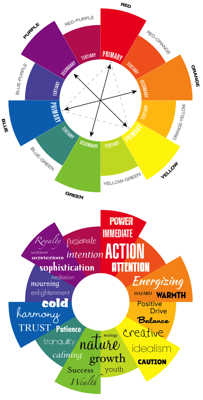
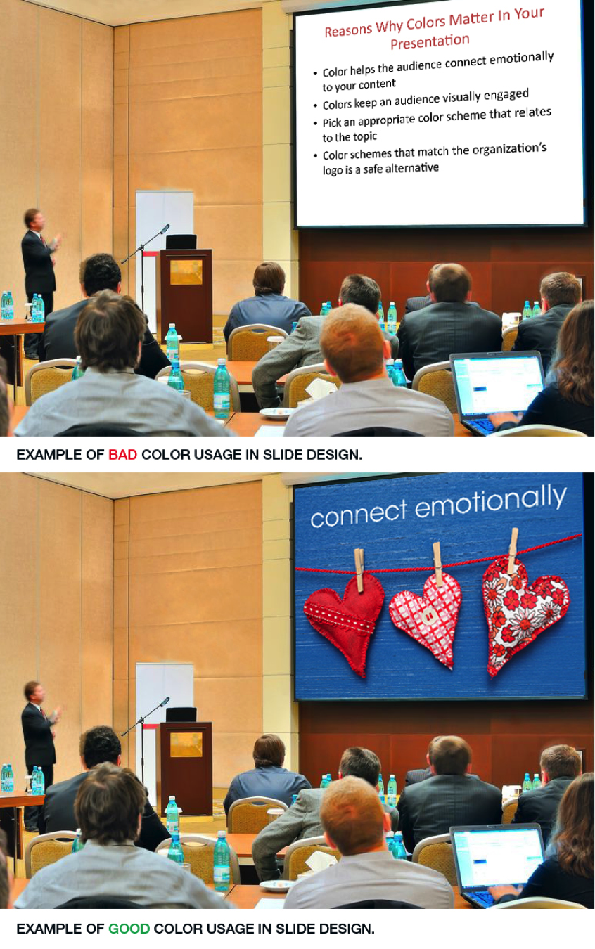
Cool Trick: Color affects our hearts and minds. An audience will respond to certain colors without realizing it, and by tapping into their emotions using a color scheme that matches your topic, you’ve made a more lasting impression.
- Red: Forces immediate action, very active, attention.
- Orange: Energizing, warming, positive drive.
- Yellow: Evokes creativity, positivity, visual antidepressant.
- Green: Conjures images of nature, growth, wealth, success.
- Blue: Expresses good health, harmony, calming, patience, suppresses appetites. Great for presenting data.
- Indigo: Displays a strong intention, forces concentration, meditation. Too much can make the composition feel heavy.
- Violet: Harmonizing, sophistication, feminine energy, royalty.
- White: Shows purity and makes the layout feel clean.
- Black: Strong and intense. Great for backgrounds because it brings stillness and binds everything inside the slide. Allows other colors to really stand out and emit their emotion.
- Gray: Communicates balance and helps all colors around it come alive.
Image credit: 123rf.com
Knowing your audience and having a better understanding about the colors you choose for your presentation can help make it more effective. Try to pick two similar colors that communicate your intended message (i.e., red and orange for immediate action such as recommendations, or green and blue for peaceful environmental awareness evaluation) and one complementary/opposite color used for emphasis to really drive home key points.
Rad Resources:
- http://kuler.adobe.com (quick access to popular color schemes based on topics)
- http://colorschemedesigner.com/ (create a color scheme and see it in action)
- http://www.pictaculous.com/ (use your logo to get the right color scheme)
- http://p2i.eval.org/index.php/p2i-tools/ (downloadable documents about effective presentation topics)
Hot Tips:
- Doubting what color scheme to use? Try the colors in your organization’s logo.
- Cool and neutral colors work best for the background, while warm colors, which people respond to more positively, work best for objects in the foreground.


Chris, this is nicely put together and helpful. I think it’s also important to remember that colors can have very different associations across cultures, i.e. http://www.informationisbeautiful.net/visualizations/colours-in-cultures/ But since, like you, I work in a U.S./Western context, your beautiful viz is helpful.
Really handy summary
What a great post – and the perfect antidote to living in black and white (or beige) … 🙂
Jane
Thanks, Chris! This is exactly what I was looking for as I prepare several presentations. You’re great at teaching me to think and communicate in color.