
Hello! I’m David Fetterman, President & CEO, Fetterman & Associates, and past-president of the American Evaluation Association. The message is loud and clear. Stephanie Evergreen, Sheila Robinson, and a host of our esteemed data presentation infographics and data visualization rock stars have effectively communicated: visualizing your data is here to stay. It is useful as a way to sort through, analyze, and understand a mass of data. It is also an important way to communicate your findings and have an impact.
Google’s Data Studio is another data visualization tool to add to your toolbox. It allows you to import your own small data set from an Excel spreadsheet or download massive data sets from the Census Bureau or World Bank. Here is a brief illustration of how it works.
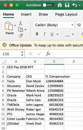
Data Source. You begin with a data source. I exported the compensation of 200 chief executives for public companies into an Excel spreadsheet. The CEO pay was reported in the New York Times (May 26, 2019, p. 5). Then I imported it into Google Sheets (Google’s online version of Excel).
Data Studio. Then I open up Google’s Data Studio to create my own data visualizations.
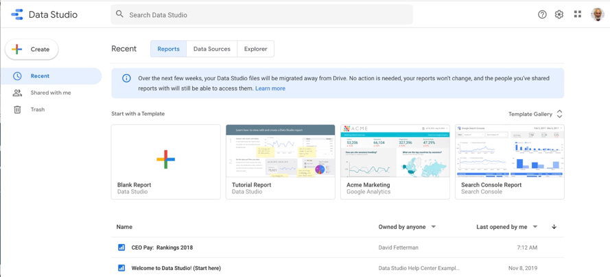
I selected Data Sources (from the top menu) and added the Google Sheet with the CEO Pay data. After that I returned to the home page and selected Blank Report (on the left side of the menu).
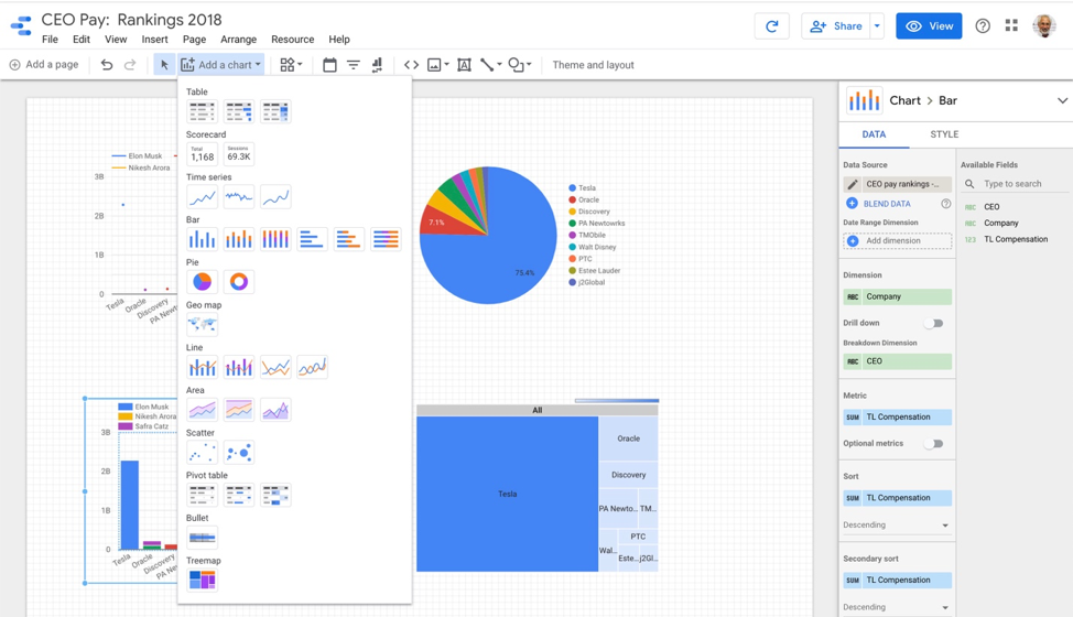
I selected “Add a chart” from the top menu and with my cursor and selected a bar chart, a pie chart, a scatter plot, and a Tree Map. As you can see I had some fun.
The program asks you to select a data source. I selected my CEO pay rankings Google Spreadsheet. I also made sure to drag the “Company” label to the “Dimension” slot, “CEO” to the “Breakdown Dimension”, and “TL Compensation” to the “Metric” and “Sort” slots. (The list of graph options are on the left side of picture below and data menu is on the right side of picture below). You can see the results.
Collaborative. I share Data Studio worksheets and reports with both my evaluation teams and the community and staff members I work with in empowerment evaluations. The free tool also allows you to blend data sources and identify and unearth previously hidden patterns.
Scalable. One of the many nice things about this program is that it can handle massive data sets as easily as tiny ones. In addition, as the original online data resource is updated, the updates automatically flow to your Google Sheets and Data Studio data sources.
Tutorials. There are free tutorials to help guide your use of this powerful free tech tool (search for Google Data Studio). You can use it to enhance your evaluation contributions to the communities you work with and in.
Acknowledgement. I am sharing what I am learning from the Knight Center’s MOOC, “Data Journalism and Visualization with Free Tools” (a free online data visualization course).
Do you have questions, concerns, kudos, or content to extend this aea365 contribution? Please add them in the comments section for this post on the aea365 webpage so that we may enrich our community of practice. Would you like to submit an aea365 Tip? Please send a note of interest to aea365@eval.org. aea365 is sponsored by the American Evaluation Association and provides a Tip-a-Day by and for evaluators.
Thanks for sharing this valuable resource, David! As an elementary school teacher working with EAL students, I recognize the power of using visual representations to enhance learning. The same can be said for adults – visualizations can help with retention and understanding. In the context of evaluations, we want to ensure that quantitative data collected can be understood, interpreted, and analyzed by various stakeholders. Being able to easily create data visualization is definitely one way to improve impact. Your step-by-step instructions also helped show how easily the Google Data Studio can be implemented. I appreciate you advocating such a useful tool!
Thanks again for sharing,
Krysta
Krysta – glad this was helpful. There are so many free and expensive tools out there – the key is to sift through and find what’s useful. Luckily this one is both free and useful. Take care and thanks for the feedback. Best wishes. – David
David, thanks for sharing. I’m finally getting on board with this tool thanks to your assistance!
Best,
Chad
Hi Chad
Glad this was useful. Ironically. the bar chart that I produced with Data Studio provided the most dramatic picture of the difference in CEO salaries – with Elon off the scale in comparison.
It is a fun tool. I also recommend the use of Flourish (which is also free). Take a look at this: https://public.flourish.studio/visualisation/919906/
Happy New Year!
– David