
Hello from Katherine Bergmann and Eryn Collins from Choices Coordinated Care Solutions, a national non-profit organization that supports individuals with significant behavioral and emotional challenges in community settings. We accomplish this by using evidence-informed methods that build on the strengths of those individuals and everyone involved.
Data drives our focus on effectiveness and efficiency at Choices and our Applied Research and Evaluation Team uses this data and translates it into consumable information that drives decision-making. We not only create detailed technical reports, we also develop infographics to present our analyses quickly and clearly for lay audiences.
We use several resources to better highlight actionable outcomes when presenting this information.
Rad Resource: Piktochart, an infographic design program, has been essential to developing our graphic materials. The website offers free and low-cost templates to kickstart your creative efforts with no professional design experience required.
Rad Resource: Additionally, we use The Noun Project for icons and symbols to add visual interest and help lead consumers through the layout of our graphic presentations. When you use this resource, you have the capability to choose between royalty free and creative commons licensure, so it can fit within any budget.
Rad Resource: Since our goal of these infographics is to create content in plain language, the Hemingway App is a great resource to help make our writing more clear and concise. This free resource highlights problem areas within our content such as complicated sentence structures, redundant vocabulary, and use of passive voice.
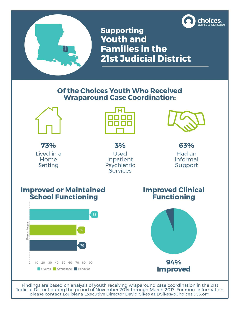
In a recent example, Choices was tasked with providing a summary of outcomes to an influential stakeholder in one of our service areas. By using the resources listed above, Choices created a visually-appealing infographic that outlined the clear improvement youth and families were experiencing within our program (Figure 1). We accompanied statistics with graphic elements to clarify the patterns and trends in our data analyses. This output illustrates how evaluators can use graphics to disseminate results that meet the information needs of multiple audiences. Creating a consumable infographic helped our stakeholder readily understand our program success and served as a resource to inform future decision-making.
Do you have questions, concerns, kudos, or content to extend this aea365 contribution? Please add them in the comments section for this post on the aea365 webpage so that we may enrich our community of practice. Would you like to submit an aea365 Tip? Please send a note of interest to aea365@eval.org. aea365 is sponsored by the American Evaluation Association and provides a Tip-a-Day by and for evaluators.
I loved this post – super handy tools. Thanks so much for sharing the resources, and providing such a great example!