
I’m Susan Kistler, of TheSmarterOne.com, and I’m on to Part III of an Innovative Reporting Series (see Part I on chocolate reports and Part II on adding video to your toolbox). Today I wanted to share lessons from a project marrying street art, evaluation, infographics, technology, and community building.
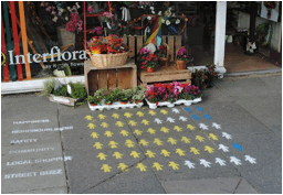
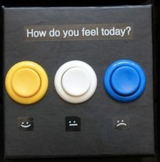 Lessons Learned: Last month, I had the privilege of interviewing Lisa Koeman, co-lead for the Visualising Mill Road project. The project placed small voting devices in 18 shops on Mill Road in Cambridge, United Kingdom. The devices asked straightforward questions about perceptions of happiness, safety, and social connectedness and had three buttons with which visitors could indicate a positive, neutral, or negative response. The questions were replaced every two days over a three week period and the information gathered was reflected in growing chalked Infographics on the street in front of each shop, with a new line added in the early hours every other day to reflect question responses in that shop.
 As the project unfolded, they evaluated “the effect of the public visualisation of community data…How can it inform people on what other members of the community think of specific local issues? Does it encourage reflection and discussion?”Although the analysis of the results is still in progress, Lisa was pleased to share that the project encouraged community discussion about the issues raised generally and the project specifically at both the point of data collection (what’s up with those little boxes and buttons?) and reporting (what’s up with those infographics on the sidewalk?). I’ll be sure that we share the final report when it comes out.
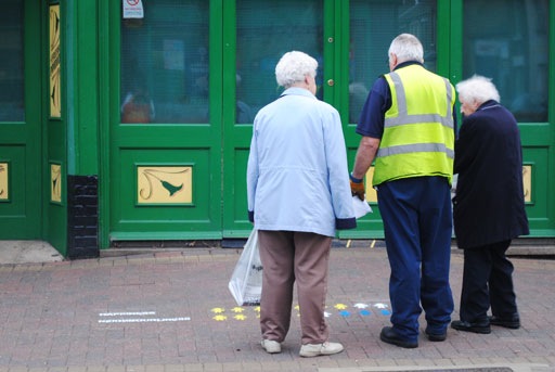 Hot Tip: For me, this statement from Lisa was the most compelling in terms of rethinking data visualization and reporting: “Lots of people go for screens, for sharing results digitally, but by positioning graphics of local data on the pavement, at people’s feet, it attracted attention and made it accessible for the community. It gave the data back to the people.” She noted that people who would be unlikely to view an online report were talking with others about the graphics and voting devices that had appeared right on their doorsteps.
Rad Resource: Learn more about the project at http://visualisingmillroad.com/.
Hot Tip: Spray painted chalk lasted all three weeks, even through rain, yet faded away over time, leaving no permanent marks.
Hot Tip: Work with community groups to gain buy-in and get permissions and to ensure that the questions asked are meaningful.
Hot Tip: By working with local artists, as part of their 5:00 AM chalking team, they found an affordable way to complete the project and gained further buy-in from an additional group living in the Mill Road area.
Do you have questions, concerns, kudos, or content to extend this aea365 contribution? Please add them in the comments section for this post on the aea365 webpage so that we may enrich our community of practice. Would you like to submit an aea365 Tip? Please send a note of interest to aea365@eval.org . aea365 is sponsored by the American Evaluation Association and provides a Tip-a-Day by and for evaluators.
Wow! This is such a neat idea of bringing the data TO the people! I feel so inspired! I’m trying to think of how I can do the same with the projects I am working on. Thank you for sharing this Susan!
Susan,
Thank you for sharing this amazing project. I am always inspired by your posts. And, slowly but surely, my data visualization gets better as a result.
(Next week, chocolates with survey results for a group of after school providers using ideas from Innovative Reporting: Part I.)
Thank you,
Jessica
Thank you so much, Susan! I loved seeing Mill Road’s visualized data in community that is accessible for so many to read and understand. These pictorials can be so affirming for sharing baseline information and helping communities move toward their dreams.
Many thanks!