
Hello dear people! I’m Stephanie Evergreen and I talk a lot about data visualization and strong reporting. Today I’m going to share with you another installment in our Fab Five Reboot series, where I redesigned five slides from five of AEA’s eStudy presenters. Let’s take a look at Tom Chapel’s slideshow.
My focus with Tom Chapel’s Reboot was on working within the limitations of an organizational template. Tom says he already veers outside of that template designated by the CDC, and has had the use of his modified slides grandfathered, but many of us are in that position of having an organizational template foisted upon us. What can we do, while still working within those constraints?

Even if Arial is the font we are forced to use, we can still add some variety and emphasis to the slides by varying the font’s weight. We can bold – or, in Arial’s case, use Arial Black – on keywords. I also adjusted the font size to make it better fit available space, though I kept it large enough for easy reading. Since Tom’s slides, in this particular case, are used for a webinar, let’s include a photo of him on the front. Even if he was reusing these slides in an in-person workshop, this would be up in the room as people filter in and find their seats, helping them identify which of the others is the speaker in advance. I took what is typically mandated (i.e., no choices in font, background, colors) and tweaked what aspects of them I could to make a cleaner slide that better represents Tom and the CDC.
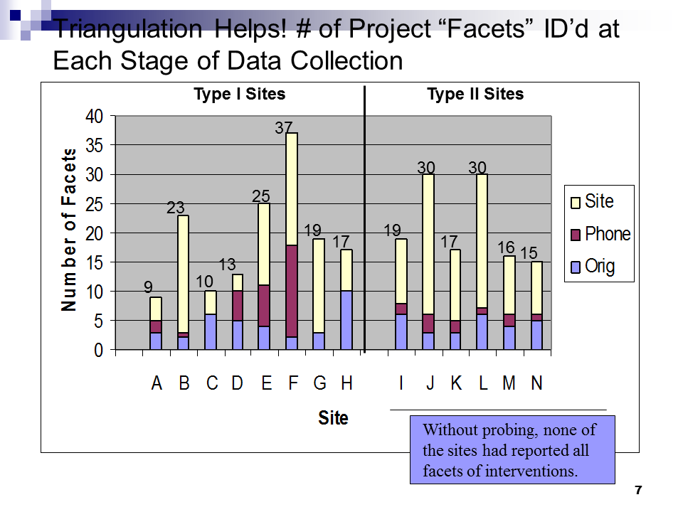
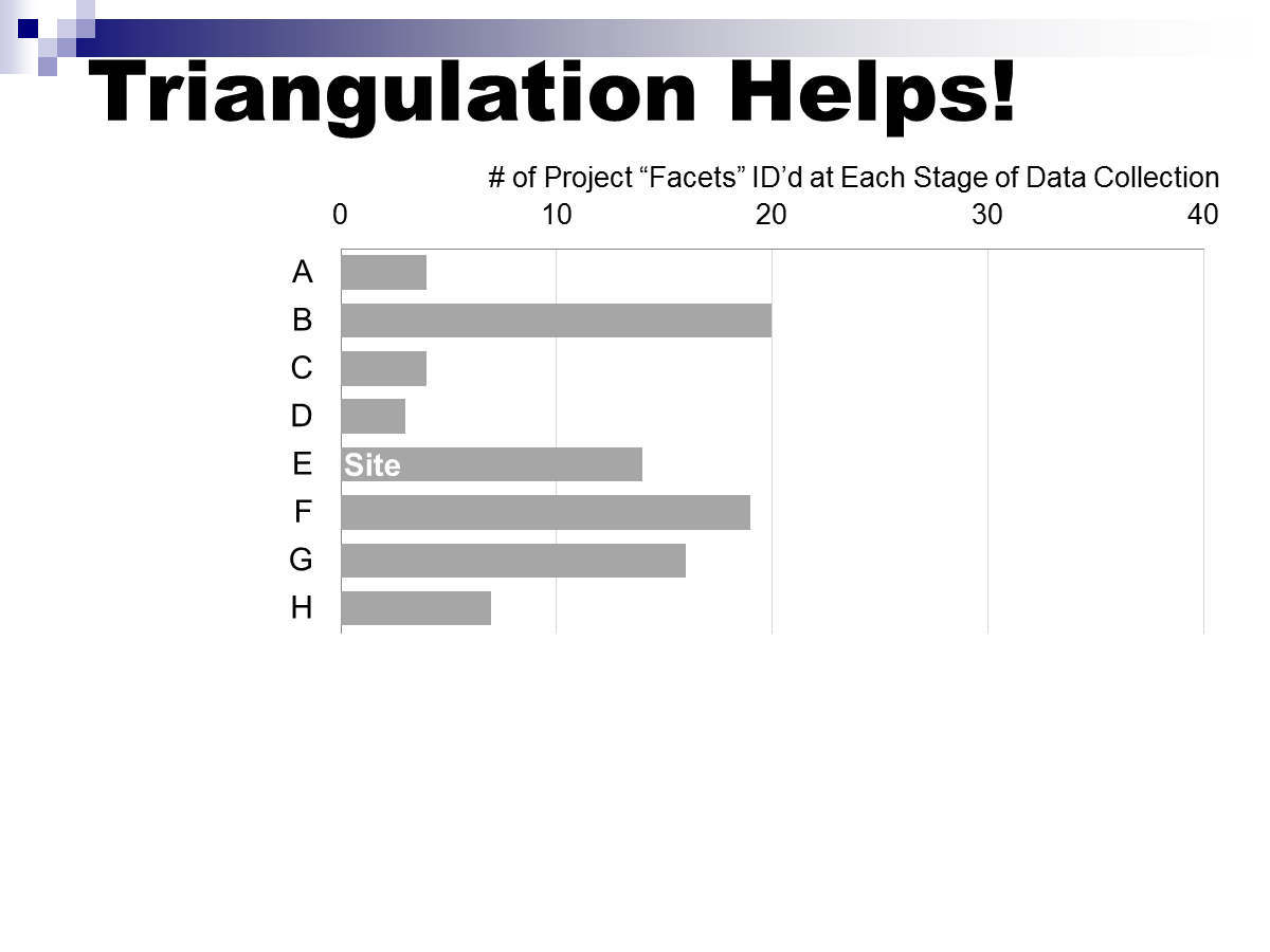
The graph had a lot going on. I simplified the data display by taking out the gray background, lightening the grid lines, and using direct labeling rather than a legend. Then I used colors from his template so the graph blends in better. Still, there’s so much happening in this slide. So I used the chart animation features so that Tom can isolate each part of the study as he shows its findings, first showing the title and axis, then (shown above) each data series one-at-a-time, then the Type I sites label, then all Type II sites (I actually had a white rectangle on top of the lower half of the graph, which I animated to Disappear on a click), then finally showing his main takeaway point. Sure, it’s still a lot of information. But by breaking it down and showing one piece at a time, we build the full slide slowly and keep from overwhelming the audience.
Read about all five rebooted slides on the Potent Presentations Initiative site and check out Tom’s workshop on Logic Models at this year’s conference.
Do you have questions, concerns, kudos, or content to extend this aea365 contribution? Please add them in the comments section for this post on the aea365 webpage so that we may enrich our community of practice. Would you like to submit an aea365 Tip? Please send a note of interest to aea365@eval.org . aea365 is sponsored by the American Evaluation Association and provides a Tip-a-Day by and for evaluators.