
Hello! We are Justin Sullivan, Libby Smith, and Kate Bentley from the Applied Research Center at the University of Wisconsin-Stout. When we attended Evaluation 2017, the AEA annual conference this year we knew we wanted to use the opportunity to get more active on Twitter. I (Libby) had avidly followed the conference hashtags in past years, but hadn’t jumped on the tweeting bandwagon. I knew that there was a growing community of evaluators on Twitter and we all wanted to be more connected to our peers and our field. With the help of our designer and social media manager, Kate Bentley, we devised a plan and dove in during the conference. We tweeted and followed others throughout the week. When we got back, we did what evaluators do…we pulled the data, analyzed it, and reported out! Here is our infographic and some hot tips:
Hot Tips:
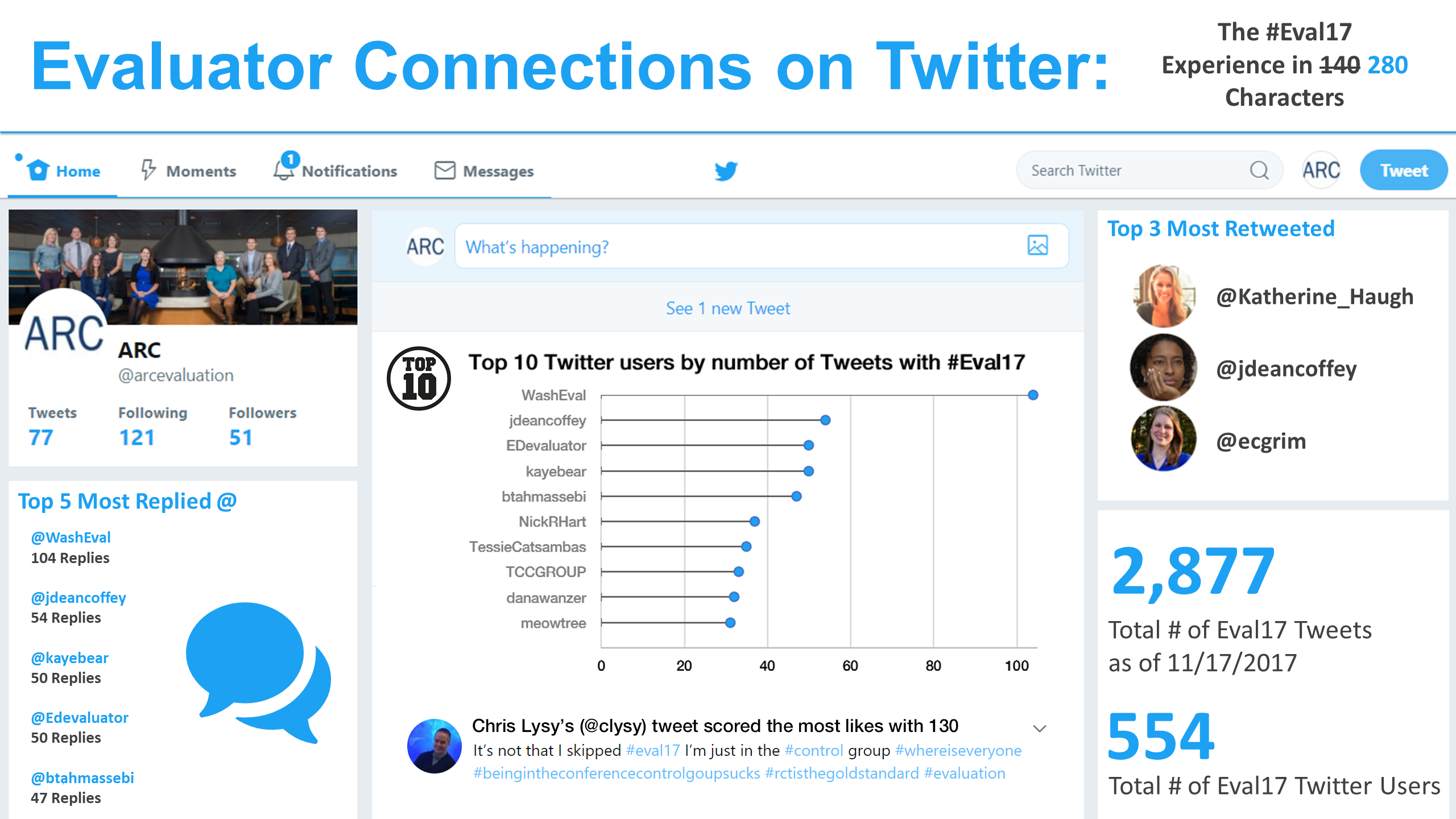
- You can scrape data from Twitter using R to analyze trends. This approach allows you to customize your search to focus on hashtags (#Eval17) or specific Twitter users. The resulting data set will include tweets, user names, and like and retweet data. You can also pull data to create a snapshot of what’s happening now or track trends over time.
- Here is a step-by-step guide on how to connect R to Twitter to pull data. This guide is designed for first time R users. Learning how to code in R can be daunting; it comes with a steep learning curve. This guide includes a graphical user interface and code that you can simply copy and paste into R to get things going quickly. After working your way through this exercise, you will have a basic R skillset you can use to try other things.
- When creating an infographic, it’s best to start by choosing a color palette using 4-6 colors. Choose colors that are complementary (think opposite sides of the color wheel) and suitable to your project. If you are working with an organization, use the palette they use for their branding.
- The Noun Project has arguably the best icons on the web. You can search from over a million icons from thousands of authors. Licenses are available under Creative Commons, and there is both a free and paid version. These are high quality icons that will make your project stand out. Your icons should match the data you are presenting in content and context. Download a few icons and start thinking about how you plan to layout your content.
- Use PowerPoint to start making infographics. It’s a simple interface with useful tools to move things around. Be sure to choose a catchy title, infuse a bit of variation in the size and scale of your icons, and try not to have too many repeating graph selections.
Thanks for reading and we look forward to seeing you at #Eval18!! You can find us on Twitter @arcevaluation and online at ARCevaluation.com.
Do you have questions, concerns, kudos, or content to extend this aea365 contribution? Please add them in the comments section for this post on the aea365 webpage so that we may enrich our community of practice. Would you like to submit an aea365 Tip? Please send a note of interest to aea365@eval.org . aea365 is sponsored by the American Evaluation Association and provides a Tip-a-Day by and for evaluators.