
Hello! I’m Fiona Remnant, founder of a small UK social enterprise set up to continue developing and applying QuIP – a new qualitative social impact assessment tool, from research conducted in the Centre for Development Studies at the University of Bath.
The problem?
The QuIP team have been experimenting with a form of ‘goal-free’ evaluation for the past few years, challenging people to think differently about how to collect and use qualitative data, but one of the challenges which keeps us awake at night is how best to convey respondents’ views in a way which captures commissioners’ attention.
We assume and respect that the stories of change we collect represent a ‘truth’ for the ‘intended beneficiaries’ (knowing how contested and hated this phrase is!), so how do we ensure that these complex stories reach decision-makers and challenge assumptions about causation and impact?
Rad Resources:
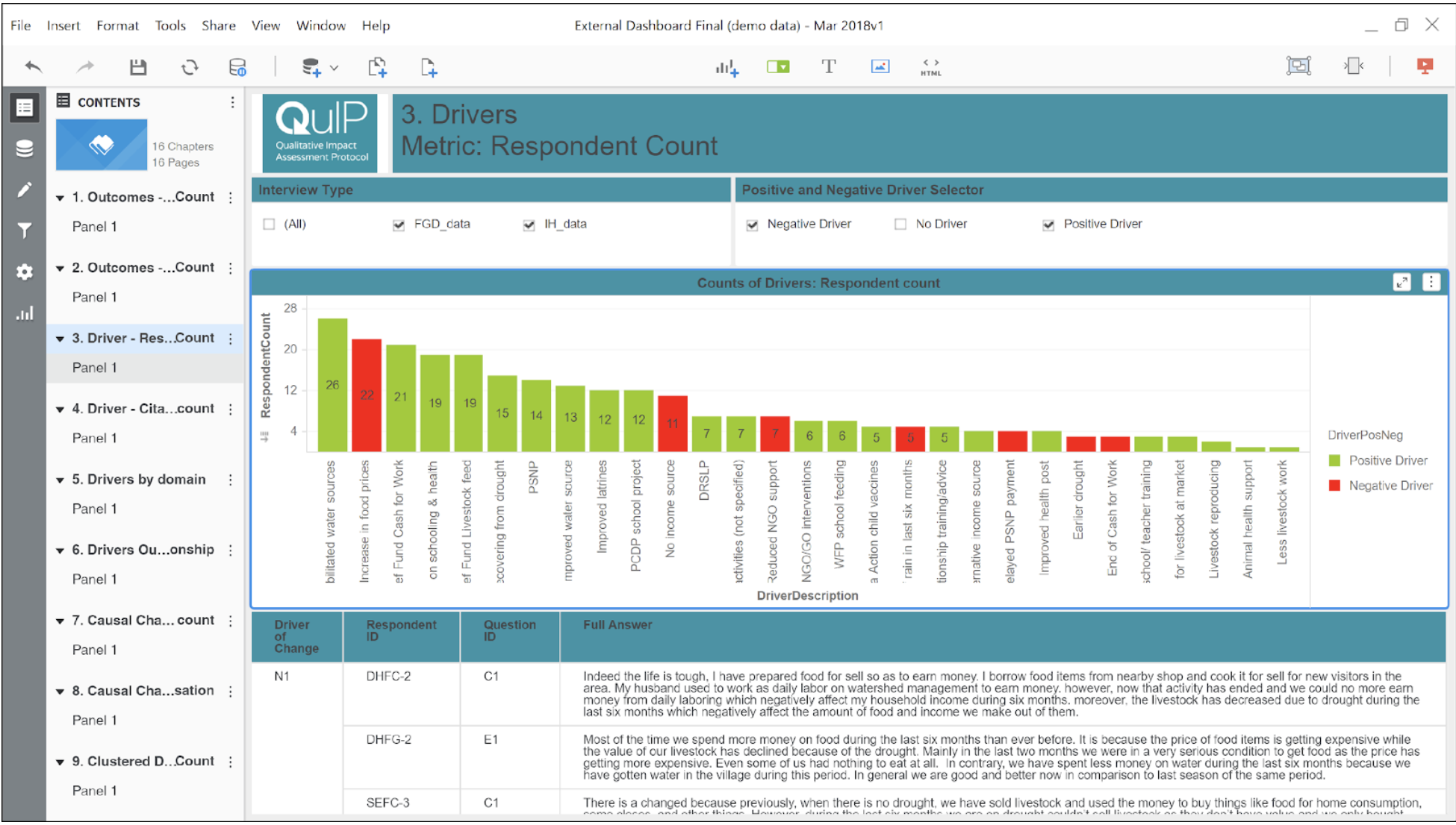
Our solution to this has been to rely on our own approach to thematic analysis (within with the wonder of Excel!), counts of which then enable us to plug into software like Tableau and MicroStrategy to visualize findings to answer the following questions:
- What were the key reported drivers of change?
- What were the main outcomes reported?
- How closely did these stories align with the project’s aims; how far can we attribute change to the intervention?
- Putting drivers and outcomes together, what were the causal pathways which led to change?
MicroStrategy Desktop has been a fantastic tool, enabling us to build an interactive dashboard with narrative, filters and different chapter views – avoiding the pitfalls of an over-simplified one-page dashboard and keeping source words up front and centre.
Lesson Learned:
We have created great visualisations for each of these questions…

Positive Outcomes
…but the hardest one to nail was the last; causal pathways – the holy grail! We can produce some very neat network diagrams which show the (often very complex) relationships between drivers and outcomes, but we are still working very hard on how to accurately capture what J.L. Mackie termed INUS in these visualisations; how to label when causes are “insufficient but necessary parts of a condition which is itself unnecessary but sufficient for the result.”
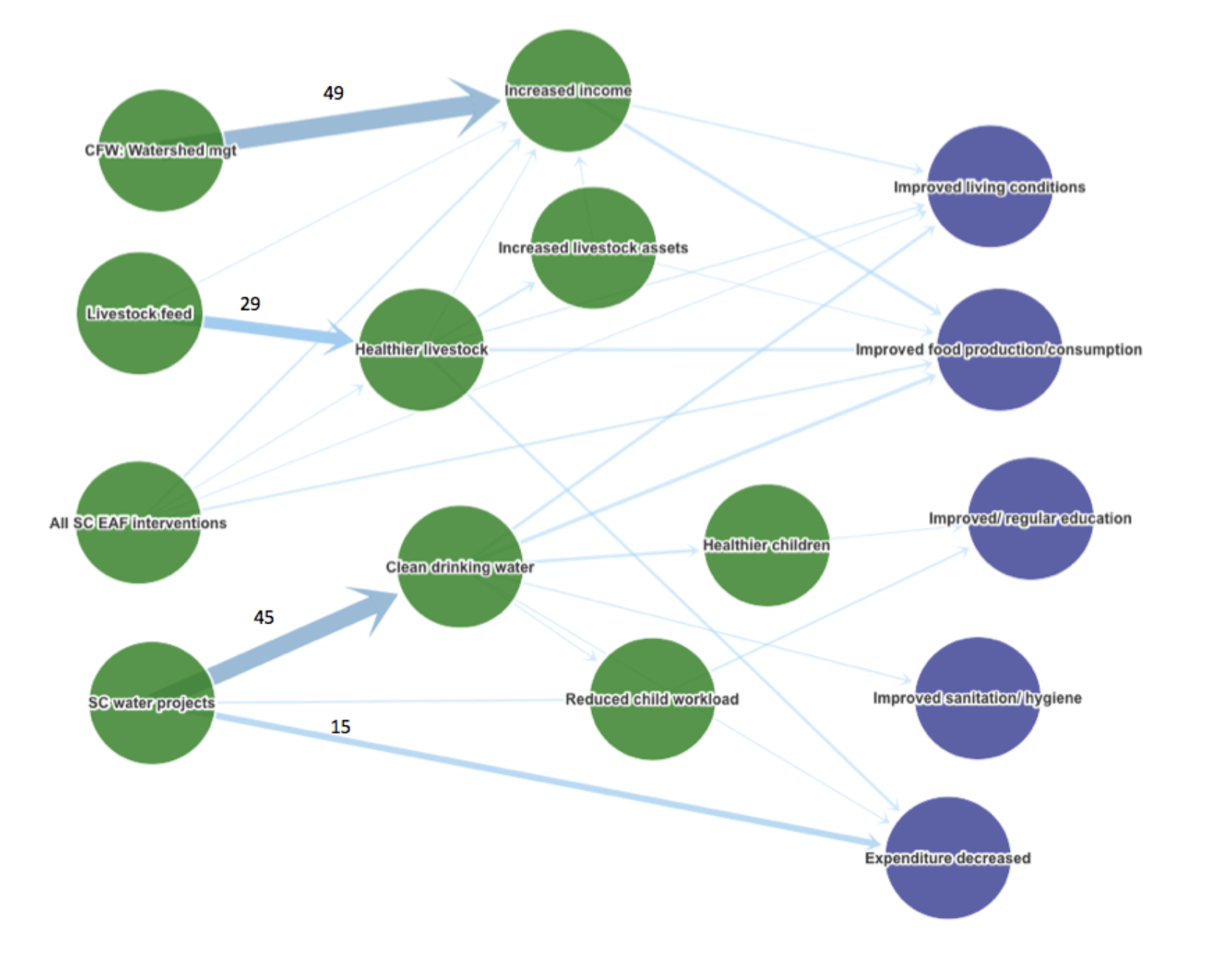
The skill of the analyst in picking up on these links, nuances and complexities cannot be underestimated. Whilst we continue to work on ways to visualize this, we are learning that making it too easy for commissioners to absorb findings ‘at a glance’ risks not doing justice to the rich and complex stories which really speak truth to power.
What evaluators really need to do is draw readers in to engage with the data, be captivated by the words behind the visuals, and acknowledge the complexity behind most causation.
The American Evaluation Association is celebrating Data Visualization and Reporting (DVR) Week with our colleagues in the DVR Topical Interest Group. The contributions all this week to aea365 come from DVR TIG members. Do you have questions, concerns, kudos, or content to extend this aea365 contribution? Please add them in the comments section for this post on the aea365 webpage so that we may enrich our community of practice. Would you like to submit an aea365 Tip? Please send a note of interest to aea365@eval.org. aea365 is sponsored by the American Evaluation Association and provides a Tip-a-Day by and for evaluators.
Hi Sheila,
Thank you for your very insightful post. I am pursuing a masters degree in education and am currently enrolled in a class on program evaluation. I was very interested in the technology presented in your article. Interpreting data can be very confusing and your technological models are intriguing. The MicroStrategy Desktop is very appealing visually. It is extremely informative,revealing a lot of information in a small space. I particularly like the colour-coding to determine the differences between positive and negative drivers of change.
I think this application could be very useful in a variety of program evaluations. For example, as a teacher, I am often encouraged to use student data in order to reflect on and improve teaching techniques; I tend to do this with a team of teachers in a professional community. For example, we can go through several pieces of student writing and look for commonalities that are both positive and negative. This tool could help us determine what to focus on in our teaching. If students are struggling with transitions, we’d see the number of students in that table high in that negative driver bar on the graph. However, we might also notice that several students are using specific vocabulary effectively by its revelation on the graph.
I am curious about how you have been able to develop such a useful application? Is this your particular area of speciality? Are these technologies still in their draft stages or have you been using them as evaluation tools already?
Thank you for your patience in dealing with my very limited knowledge of program evaluation. I am very intrigued by your post!
Hi Fiona, thank you for the wonderful post about how QuIP has been battling the challenge of representing qualitative data in a way that will capture the attention of decision-makers, whilst lending a way to present causation and impact. My name is Nicole Lauzon and I am currently enrolled in the Professional Master of Education program at Queen’s University (Kingston, Ontario) and have been taking PME802 – Program Inquiry and Evaluation. Throughout the course we have been looking at different approaches to program evaluation and have been working on designing our own program evaluation. Something that we haven’t dove deep into understanding is the analysis of data, although we were required to stipulate how we could analysis our data if we were to actually implement our program evaluation. I have taken several statistical analysis courses, so I have more of a background in dealing with quantitative data rather than qualitative data. I have always believed firmly that qualitative data has such an important role as a social impact assessment tool, as it allows us to capture a real feel for how program accessors view such programs. I was intrigued with the QuIP approach to coding qualitative data and the 3 step process in combination with the MicroStrategy tool. As I included a form of qualitative data collection in my program evaluation design, and was questioning how I would analysis my qualitative data, your post and explanation of the QuIP approach helped to plant a seed in my head about how I could potentially analyze this data.