
Hello from Vancouver, BC, Canada. My name is Janina Mobach. I work as the internal evaluator for the University of British Columbia Learning Exchange. Part of the university located off-campus in Vancouver’s inner city, our aim is to bring people together to exchange learning that leads to social change.
Applying visualization concepts into my work evaluating our Seniors Thrive program was not an option, it was essential. Since the program seeks to reduce social isolation amongst seniors experiencing marginalization, we work with people with limited English, low literacy levels, little income, and/or mental health and addiction issues. As such, I needed a way to communicate that was accessible for people across cultures and socio-economic classes.
Having a creative bent, the visualization ideas came quite naturally. But how did I translate my thoughts and paper sketches into the digital realm? Where could I begin?
Rad Resources:
Thankfully I stumbled across DiY Data Design by Chris Lysy (diydatadesign.com), my portal into the data visualization world. Chris has taken the overwhelming amount of information and packaged the concepts, techniques, and tools into digestible pieces. The best part is that it is affordably priced so it was easy to get approved. Much of what I’ve learned about visualization concepts was developed through membership in this group.
Hot Tips:
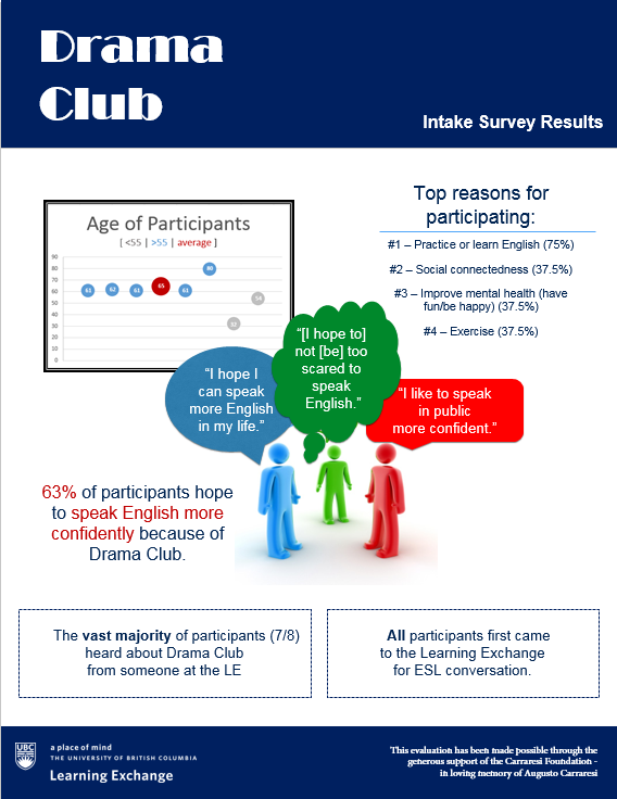
Microsoft PowerPoint. We’ve all used it for presentations. But did you know you can also use it to create visually rich reports?! It is now my go-to for all developmental evaluation updates and reports for Seniors Thrive.
Here’s an example:
Lessons Learned:
Match your context.
As evaluators, we think about context all the time. But do we think about it in the realm of visualization? I’ve learned the way I apply visualization concepts needs to match my context. My goal is that another evaluator could look at my reports and surmise what my context is like.
Lessons Learned:
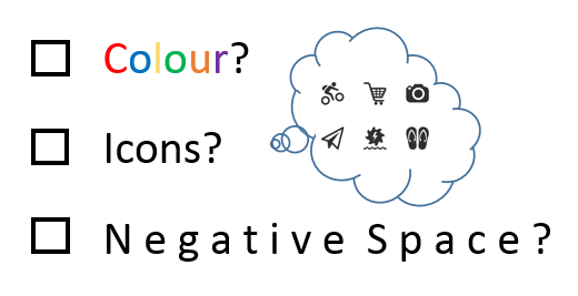
There are a lot of visualization techniques out there, but I keep coming back to these three simple ideas of colour, icons, and negative space. They’re my fundamentals, my checkpoints. How can I best use colour? What icons would capture my ideas? How am I using negative space to enhance readability?
Lessons Learned:
Everyone loves it. The seniors have really appreciated the colourful reports. “I love this. I get it now,” one senior exclaimed. But they aren’t the only ones. My supervisors have welcomed the format because it takes less of their valuable time to read. Even our funder was thrilled, “I was captivated, it was like reading a story.”
The American Evaluation Association is celebrating Data Visualization and Reporting (DVR) Week with our colleagues in the DVR Topical Interest Group. The contributions all this week to aea365 come from DVR TIG members. Do you have questions, concerns, kudos, or content to extend this aea365 contribution? Please add them in the comments section for this post on the aea365 webpage so that we may enrich our community of practice. Would you like to submit an aea365 Tip? Please send a note of interest to aea365@eval.org. aea365 is sponsored by the American Evaluation Association and provides a Tip-a-Day by and for evaluators.
Hello Janina,
Thank you very much for sharing this informative resource about contextual visualization. I’m currently working on my evaluation report about sharing my data and recommendation to various types of audiences. Before read your post, I have rarely paid too much attention about creating visually rich reports for my program evaluation. I really appreciated the three visualization techniques that you shared with us: colour, icons and negative space. I will always keep these visualization concepts in mind while working on my data reporting.
Also, thank you for sharing DiY data design to us. It’s an absolutely amazing useful resource.
Sincerely,
Eva Du