
My name is Elissa Schloesser with Visual Voice, I am a freelance graphic designer specializing in infographics, data visualization and reporting. I enjoy making complex information more understandable and engaging. I have partnered with several evaluators to help visually communicate evaluation methods and findings.
Below are a few techniques I use to make logic models, theory of change and other process diagrams more visually appealing and digestible.
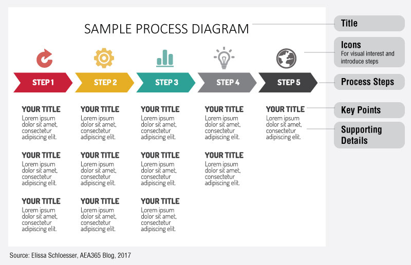
Hot Tip: Start by considering your diagram’s purpose and audience. Edit content accordingly.
Is your diagram intended to be analyzed up close by your reader, or is it intendd to provide a visual overview of your model or process? If its purpose is to be used as a summary, only include the most important and relevant information.
Hot Tip: Establish a hierarchy of information and apply a consistent design style to each level.
Not all information should get equal visual weight and real estate. The main concepts and connections should be the biggest and boldest, while the supporting details should be formatted to be smaller and lighter. Establish a design style for each level of information and make sure it is applied consistently throughout. This is especially important when you are working with a diagram that has lots of layers of information.
Hot Tip: Use color to enhance your diagram, not make the diagram.
I like to think of color as a bonus feature in any diagram. Selective color use can help emphasize connections in your diagram (but try not to get carried away). If you use every color in the rainbow, it tends to be less effective. Additionally, I like to test to see if my diagram is still understandable in grayscale even if it will most likely be viewed in color. If the diagram is not understandable without the color, go back and readjust the line weight, headings or iconography.
Rad Resource: Below is a sample process diagram to help illustrate the points above. It is similar in structure to what you might use for a logic model. This diagram could be recreated in Word or PowerPoint in a table with invisible borders.
Rad Resource: For more advice on how to make your diagrams more digestible, check out this blog post by Grank Denneman – “10 guidelines for creating good looking diagrams”.
The American Evaluation Association is celebrating Data Visualization and Reporting (DVR) Week with our colleagues in the DVR Topical Interest Group. The contributions all this week to aea365 come from DVR TIG members. Do you have questions, concerns, kudos, or content to extend this aea365 contribution? Please add them in the comments section for this post on the aea365 webpage so that we may enrich our community of practice. Would you like to submit an aea365 Tip? Please send a note of interest to aea365@eval.org. aea365 is sponsored by the American Evaluation Association and provides a Tip-a-Day by and for evaluators.