Greetings fellow evaluators. I am excited to share my experiences and lessons learned in our effort to improve access to and use of data in decision making through the development and use of a web-based interactive dashboard.
My name is John Manda, and I am the Learning and Dissemination Advisor on the United States Agency for International Development-funded Scaling Up Nutrition Learning and Evaluation (SUN LE) project in Zambia. SUN LE supports the Government of the Republic of Zambia in generating evidence and facilitating data use to inform programme decisions for the Scaling Up Nutrition (SUN) programme, which aims to reduce stunting and improve overall nutrition among children under 24 months of age. The SUN programme is coordinated by the National Food and Nutrition Commission of Zambia.
In my experience providing research, monitoring, evaluation, and planning support to various health-related programmes, I have faced two major challenges. First, not having relevant and easily available geographically specific data. Second, a limited use of data in decision making. The SUN LE project has focused on these two problems, among others, to help partners improve the use of data.
What the dashboard highlights
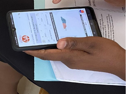
To facilitate data use in decision making, we developed a web-based interactive dashboard that presents information in a simple, easily accessible, and digestible form. The dashboard presents indicator data from the 2019 baseline survey of the SUN programme conducted in 30 priority districts of Zambia. The indicators are focused on child and maternal nutrition, and access to food, water, sanitation, and hygiene by geographic location. The dashboard allows the user to disaggregate indicator data to the provincial and district levels, and it sits on the National Food and Nutrition Commission website.

Why the dashboard is a suitable channel for promoting data use
The interactive dashboard was designed to provide easy access to data in a consistent and simple manner to SUN programme officers at all vertical levels (national, provincial, district). With convenient access to data, managers can make more informed decisions that enhance evidence-based programming for better nutrition outcomes.
Challenges with the use of the web-based interactive dashboard
Although the dashboard is available online and in a user-friendly format, poor quality and expensive Internet means some intended users struggle to access the dashboard. In addition, some level of technological competency is required to navigate the dashboard, and those users without sufficient technological skills can find it difficult. But more importantly, the absence of a data-driven culture can limit the use of the dashboard for programme decision making.
What we do to sustain and promote the use of the dashboard
We have learned that it is not enough to develop information products. Rather, we need to use every opportunity to draw attention to the dashboard. Instead of developing PowerPoint presentations to share data during planning sessions and meetings, we direct participants to access the data through the dashboard. This has helped improve familiarity with the dashboard and the likelihood of it being used in the future.
I hope you found this information useful. Please do share your experiences on what you have learned while implementing similar interventions and share your thoughts in the comments below.
The American Evaluation Association is hosting Data Visualization and Reporting (DVR) Week with our colleagues in the DVR Topical Interest Group. The contributions all this week to AEA365 come from DVR TIG members. Do you have questions, concerns, kudos, or content to extend this AEA365 contribution? Please add them in the comments section for this post on the AEA365 webpage so that we may enrich our community of practice. Would you like to submit an AEA365 Tip? Please send a note of interest to AEA365@eval.org. AEA365 is sponsored by the American Evaluation Association and provides a Tip-a-Day by and for evaluators. The views and opinions expressed on the AEA365 blog are solely those of the original authors and other contributors. These views and opinions do not necessarily represent those of the American Evaluation Association, and/or any/all contributors to this site.

Dear John
Indeed the culture of data use is steadily taking root but it needs capacity enhancement on how to make use of the data considering that the high staff turnover. Probably we need an online easy to follow manual/tutor so that individuals can manage to login and seek data they require. Just for thoughts and once more this is great for our learning agenda
John, this is great stuff. Too often, people have a view of dashboards that they’ll be used just because “we” built them. There is a whole separate marketing and educational cycle that is needed to make sure that we mainstream the use of data into culture. Keep pushing!