
Our names are Marc Wheeler and Salem Valentino and we are internal evaluators for Big Brothers Big Sisters of America.
There is a lot of buzz today about infographics. Many of you may have thought about using infographics in your evaluation reports to try to translate your findings more effectively. We recently took the plunge and incorporated infographics in our 2013 Youth Outcomes Report .
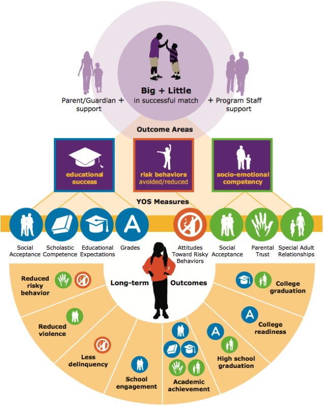
For example, we created the infographic below to clarify the theoretical connection between the short-term outcomes we currently measure for each youth and those long-term outcomes of interest to many stakeholders. The graphic summarized a large quantity of research literature in a single infographic that was easily interpretable and concise.
Lessons Learned:
- High-quality infographics require a certain level of expertise; as we didn’t have the relevant experience in house, we contracted with an external graphic designer who delivered great results.
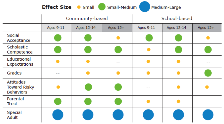
- Beyond experience, it also takes time to develop your infographics and get them right. First, you need to figure out the story behind your data. Then, what are the best ways to illustrate this story, while remaining true to the data? For instance, we wanted to communicate effect sizes but didn’t want to take up space in our report explaining what they meant to a lay audience. So instead, we developed the visualization below to better illustrate our story of the magnitude of youth outcomes. Lastly, infographics require a number of iterations and can benefit from the input of diverse audiences. Budget your time accordingly.
- Understanding your project needs will help you choose the right designer. We looked at several resources on the internet to find a graphic designer. For us it was important that our work with the designer was collaborative; we wanted to ensure the quality of the evaluation content. Due to our timeline, it was also important that our designer could design the entire report and not merely the infographics. You may also want to ask your designer how comfortable they are with Excel or other types of data you will be using in the report.
Rad Resources:
Elissa Schloesser at Visual Voice – our designer’s 5 Steps for Translating Evaluation Findings into Infographics
Visual.ly’s Marketplace service will find a designer for you and help you create an infographic for one price.
Easel.ly is a website where you can create your own infographic for free.
The American Evaluation Association is celebrating Best of aea365, an occasional series. The contributions for Best of aea365 are reposts of great blog articles from our earlier years. Do you have questions, concerns, kudos, or content to extend this aea365 contribution? Please add them in the comments section for this post on the aea365 webpage so that we may enrich our community of practice. Would you like to submit an aea365 Tip? Please send a note of interest to aea365@eval.org . aea365 is sponsored by the American Evaluation Association and provides a Tip-a-Day by and for evaluators.