
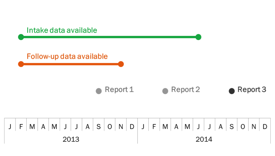
My name is Angie Ficek and I am a Program Evaluator at Professional Data Analysts, Inc. (PDA), a small firm in Minneapolis, MN that specializes in public health evaluation. Every once in a while I include timelines in my reports and/or presentations. I know there are many tools out there to create timelines, including Office Timeline and Timeline Maker, but recently I have been using a standard line chart in Excel. Say what?! Yes, I know, it’s crazy! But look at this lovely timeline!
So how do you do it? Like I said, you will want to use a line chart in Excel. For this example, here is what my datasheet looks like:
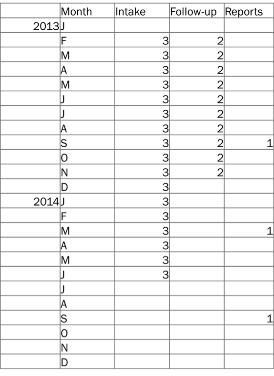
The first two columns are the year and month, and then I have a column for each timeline event – Intake data, Follow-up data, and Reports. Since I want these three events to appear in that order, from top to bottom, I typed in a 3 for each month for which there is Intake data available. I did the same for the Follow-up data with the number 2. And then for the Reports, since these happen at one point in time versus being continuous, I typed a 1 in the month in which a report is submitted, but left the cells in between blank. The exact numbers that you use aren’t as important as having equal spacing and the right amount of spacing between the events. For example, 2.5, 1.5 and .5 would have worked just fine too, but 3, 1.5, and 1 would have resulted in uneven spacing between events, which can be distracting to your audience and personally makes me twitch.
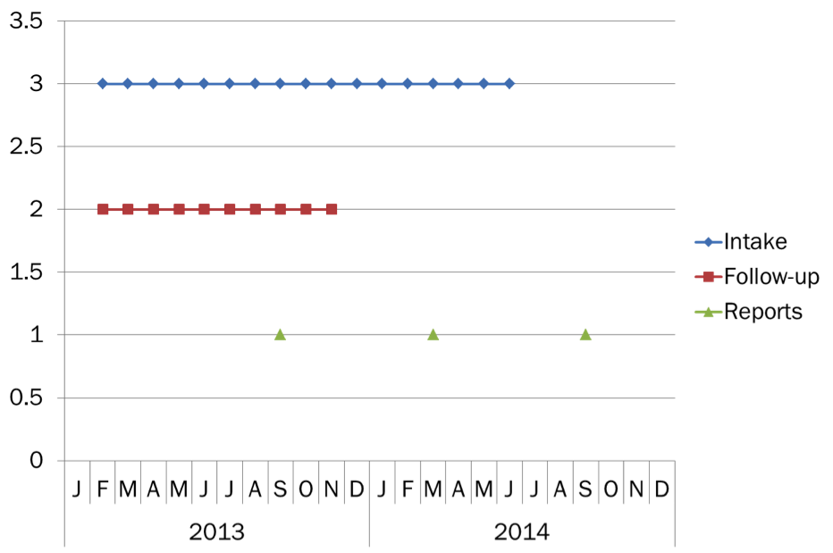
Ok, so our data is set up, and our chart looks something like this:
Not quite to the final product, but you’re close. From here we delete the vertical axis (and adjust the axis range if needed), the gridlines, and the legend, then reformat each data series. Change the marker type for the Reports to a sunburst, or circle, and adjust the color. Get rid of the markers for the Intake data and Follow-up data series and adjust the line color and width. Then, one at a time, select the first and last data points of these two series to add a sunburst, or circle, to the start and end of them. The final step is to label each event as needed with a text box.
Do you have questions, concerns, kudos, or content to extend this aea365 contribution? Please add them in the comments section for this post on the aea365 webpage so that we may enrich our community of practice. Would you like to submit an aea365 Tip? Please send a note of interest to aea365@eval.org . aea365 is sponsored by the American Evaluation Association and provides a Tip-a-Day by and for evaluators.