
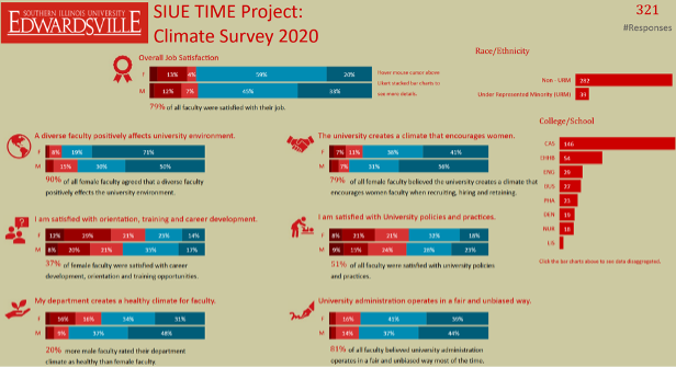
Hello, we are Matt Feldmann and Tom Withee with Goshen Education Consulting. Matt Feldmann is the principal researcher and firm director at Goshen Education Consulting and manages the information technology for the AHE TIG. Tom Withee is a senior researcher at Goshen Education Consulting and is the chair elect for the STEM TIG. It is our belief that creating interactive data dashboards are not only an effective means for communicating with your clients, but they create huge time savings. For our discussion, we will reference a University Climate Survey data dashboard from our client Southern Illinois University Edwardsville (which can be retrieved from this link).
Lesson Learned: Give the People the Power
An interactive data dashboard provides a user-friendly interface to look at different data scenarios. The dashboard above allows a user to select a category to delimit data by race/ethnicity, by College/School, or even by any one of the response categories.
Lesson Learned: Save Time with Communication
Many of our clients love our visual reports but are constantly asking for different scenarios. Now we anticipate these scenarios and build this into the dashboards.
Lesson Learned: A Short Cut to Reporting
Most of our clients still want regular summative narrative reports. A forward-thinking dashboard will provide us with a short cut to the desired static tables and graphs. Essentially, we run the desired scenarios, clip the graphics from the interactive data dashboard, and paste that directly into the reports. Also, we adapt and reuse the same dashboards annually for our clients (and adapt them for similar clients). This amounts to huge time savings to our consulting time.
FAQ: Doesn’t this mean more work?
Learning Power BI, Tableau, MS Excel, or even Google Sheets may seem daunting, but it is not any more difficult than learning most statistical programs. The time you put into learning these programs will positively impact your ability to display data quickly and effectively in the future.
Rad Resources:
AEA regularly has eStudies, pre-conference workshops, and sessions at the Summer Evaluation Institute. A search through this AEA365 on the search term “data dashboard” yielded about 80 posts about data dashboards. Also consider these resources:
- Connect with the Data Visualization and Reporting Topical Interest Group
- Check out the AEA eLibrary. There are 30+ entries associated with the search term “data dashboard” that provide you with direction for developing your own dashboards.
The American Evaluation Association is hosting Assessment in Higher Education TIG Week. The contributions all this week to AEA365 come from AHE TIG members. Do you have questions, concerns, kudos, or content to extend this AEA365 contribution? Please add them in the comments section for this post on the AEA365 webpage so that we may enrich our community of practice. Would you like to submit an AEA365 Tip? Please send a note of interest to AEA365@eval.org. AEA365 is sponsored by the American Evaluation Association and provides a Tip-a-Day by and for evaluators. The views and opinions expressed on the AEA365 blog are solely those of the original authors and other contributors. These views and opinions do not necessarily represent those of the American Evaluation Association, and/or any/all contributors to this site.