I’m Susan Kistler, the American Evaluation Association’s Executive Director, and I contribute each Saturday’s aea365 post. The start of the year seemed like a good time to look reflectively at 2010 monitoring data for aea365.
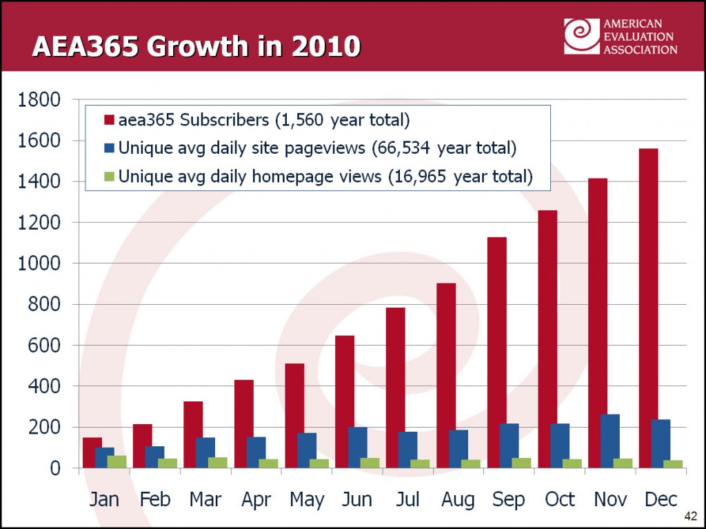
Lesson Learned – Compile information from multiple sources: Back in May, I wrote about monitoring blog use using Feedburner and Google Analytics. What we realized is that we needed to compile the resulting data from both sources into a single place in order to examine the available information and report via a single chart. The chart below shows the subscribers (from Feedburner) and pageviews (from Google Analtyics).
Lessons Learned – Consider an average day: We wanted to gain an understanding of how people received aea365 content and how that changed over time. There were lots of day-to-day fluctuations due to the day of the week and promotional pushes, so we took a daily average for each month in order to understand the overall trend in a concrete way.
Looking across both sources of data illuminated the picture. At the close of January 2010, on an average day 148 people received aea365 by email or RSS, there were 61 visits to the aea365 homepage, and 101 internal pageviews. By the end of December 2010, on an average day 1,560 people received aea365 via email or RSS, there were 47 visits to the aea365 homepage, and 238 internal pageviews.
Our outreach efforts for aea365 direct readers (a) back to specific posts and not to the site’s homepage, and (b) to subscribe. The data and chart reflect this via the overall growth in subscribers and the more than doubling of the internal page views, yet with the unique homepage views remaining low and varying up and down from month to month.
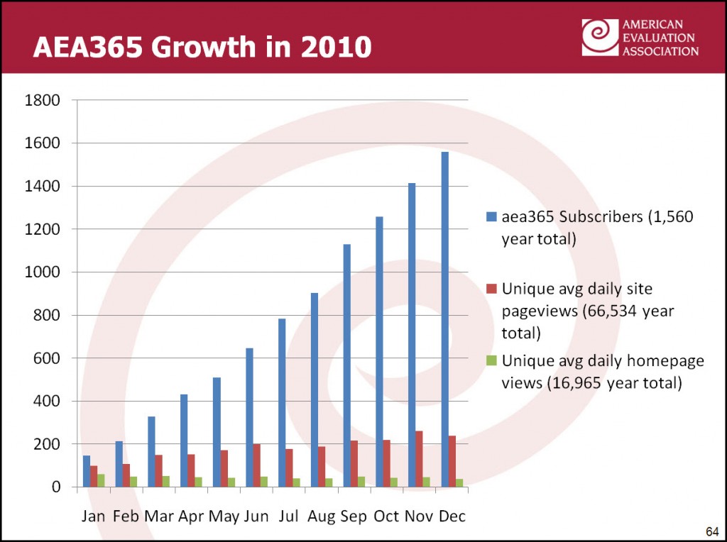
Hot Tip – Cleaning up a chart: Yesterday, I listened in on the trial-run of Steve Fleming’s AEA Coffee Break Webinar (CBW) on Evaluating Data Visualizations. Building on his November 30 aea365 post, and using a concrete example, Steve walked through how to apply key design concepts from Edward Tufte and Stephen Few to make clear graphics that emphasize the data story. Using Steve’s design guidance and kuler to identify particular colors, I went from the default design below to the one you see above.
Steve will be giving the Data Visualization webinar on Thursday, January 20, from 2:00 – 2:20 Eastern. If you are an AEA member, it’s free to attend (register here). If you are not a member, you can join AEA or purchase a one-year CBW pass to the 30+ coffee break webinars for $80 ($30 for full-time students). The pass includes a one-year AEA membership and free access to the recorded CBWs from 2010.


