
I’m Marissa Marzano, and I’m the Communications Specialist at the New Jersey Coalition Against Sexual Assault. I’ve sat through many a PowerPoint jam-packed with utterly fantastic information, only to leave a session and wonder, “What was that about again?”
You’ve crunched the numbers, you’re geeking out over your results… now how do you ensure your data sticks when you go out and present?
Good design is more than just pretty slides – in fact, I like to think of it as the last “to do” for any researcher. Research has shown us that stellar graphic design helps an audience store information in their long-term memories (where we tuck away facts until we need to recall them later) by drawing in their attention and making each piece easier to digest. Hence: no more users logging off your webinar, having a colleague ask “How was it?,” and having nothing to report because they can’t recall anything.
So, how do we marry great data with gorgeous design?
Hot Tip: GO BIG OR GO HOME
Our brains work visually – it’s why we salivate at Big Mac commercials and enjoy scrolling through Instagram more than Twitter. Think of the top lines from your data – the most important concepts that you want your audience to retain – and pair them with a striking visual that will boost recall. See the example to the right: the text refers to “building” relationships, paired with an image of someone building with sand. Try sites like Pixabay or Death to Stock Photo for some free, high-quality images to boost your presentation.
 Hot Tip: BE ICONIC
Need a way to break down key point that won’t fit with an image? You can achieve a similar recall effect by pairing data with strong iconography – see the slide at left. You can access quality free icon packs online at flaticon.com, or if you’re feeling ambitious and have some time on your hands, create anything you want – you can find open-source and editable vectors through Creative Commons’ search function and jazz them up in Adobe Illustrator.
Lesson Learned: IT’S NOT LIKE COOKING…
…in that you don’t have to start from scratch. Sites like Piktochart or Canva offer a variety of 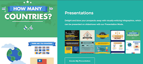 templates for presentations, already sized perfectly to run on PowerPoint. They’re a great jumping off point where you can easily plug-and-chug pieces of data to fit into templates, instead of starting from scratch.
Remember to make sure your results put their best foot forward – and leaves a lasting impression!
Do you have questions, concerns, kudos, or content to extend this aea365 contribution? Please add them in the comments section for this post on the aea365 webpage so that we may enrich our community of practice. Would you like to submit an aea365 Tip? Please send a note of interest to aea365@eval.org . aea365 is sponsored by the American Evaluation Association and provides a Tip-a-Day by and for evaluators.
Well, I think for the icons, https://icons8.com/ would be way better. good quality icons for any project. take a look.
Thanks Marissa, this was very useful, I’m looking forward to checking the resources you mentioned.