
Happy Saturday readers! Liz Zadnik here with a post on one of my FAVORITE topics (other than evaluation, of course): typography and font types. I believe an appreciation of fonts and some intentional steps in selecting a font or fonts can really “up our game” with proposals, reports, blog design, and even email!
I probably spend way too much time looking at fonts when I’m creating proposals, web graphics, and reports. I love how each font bring its own energy and tone, as well as how each artist creates something that conveys a distinct personality. The right font can tell your reader who you are before they even take in one word. Want a fashionable header font with a chic edge? Try Moon. Looking for a more contemporary and geometric look for your blog navigation? Quicksand could be a great choice. A well-placed handwriting font like Shadows Into Light can provide a nice light and personable feel for pull-out quotes. A lot of fonts evolve and change over time and this evolution is fascinating to watch.
Rad Resource: Google Fonts is a one-stop shop for fonts. You can search according to font characteristics such as thickness, if it’s to be used as a heading, or if it’s a Serif or Sans Serif font. Once you’ve selected your font(s) you can download them to install on your computer or add them to your website using the HTML and CSS codes listed. Google Fonts offers some background on each font, statistics on its usage across the world, pairing suggestions, and links to Typecast for folks working across platforms and devices.
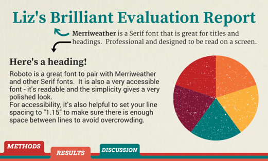
I find the font pairing suggestions incredibly helpful when I am creating a blog, report, or website style guide. Branding is so important in our digital world. Having a thoughtful and consistent looks boosts our credibility and helps visitors, readers, collaborators, or project partners engage with data and findings in meaningful ways.
Hot Tip: This may not be news to some, but keep your font types to two or three (at most). Too many font types can be distracting and actually keep people from concentrating or absorbing your information.
There’s so much more to explore when it comes to fonts. What are your favorites? Have you been inspired to try something new? What are you looking for in a font?
Do you have questions, concerns, kudos, or content to extend this aea365 contribution? Please add them in the comments section for this post on the aea365 webpage so that we may enrich our community of practice. Would you like to submit an aea365 Tip? Please send a note of interest to aea365@eval.org . aea365 is sponsored by the American Evaluation Association and provides a Tip-a-Day by and for evaluators.