
Hi, I am Miranda Yates, Director of Program Evaluation and Planning (PEP) at Good Shepherd Services (GSS), a youth and family development, multi-service agency in New York City. My PEP colleagues, Barbara Alcantara, Nora Casey, and Cathleen Mitchell, and I have developed a visually engaging report template that keeps staff focused on the key outputs and outcomes identified in their logic models.
We use Excel to create quarterly and annual reports with three sections, all of which combine text boxes and a variety of charts. The first page presents participant demographic and background information. The second page focuses on outputs. Subsequent pages provide short-term, intermediate, and long-term outcomes data.
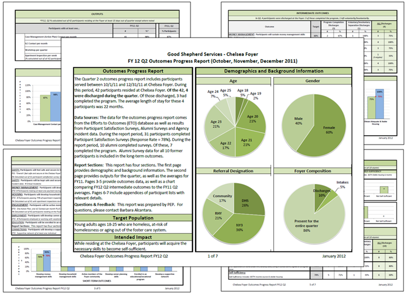
For more details on how we develop logic models and create reports staff can use, see the slides from our recent webinar.
Hot Tips:
- Context: On the first page of the report,include a brief introduction that helps orient staff to the purpose of the report, reporting period, and data sources. Identify a contact person for questions and suggestions.
- Color: Be intentional in your use of color. For example, each program area has a theme color which we use consistently. See also paper by Maureen Stone (2006) on choosing colors so as to clarify and not confuse.
- Points of Comparison: Help staff interpret output and outcome performance by providing points of comparison such as an internal or funder target, prior year performance, and system averages. This information really helps to get conversations going and further sets results in context.
- Details: Include an appendix at the end of the report with extra details that staff might want in trying to interpret the results. For programs with multiple locations, we break key information down by location. For smaller programs, we provide key information by participant.
Rad Resources:
The PEP Team are big fans of Andy Kirk’s Visualising Data blog. We were fortunate to attend a recent one-day training where we were inspired to learn that one of the pioneers of data analysis and visualization was none other than Florence Nightingale!
aea365 is sponsored by the American Evaluation Association and provides a Tip-a-Day by and for evaluators. AEA is celebrating Data Visualization and Reporting Week. The contributions all this week to aea365 come from members of AEA’s Data Visualization and Reporting Topical Interest Group. Do you have questions, concerns, kudos, or content to extend this aea365 contribution? Please add them in the comments section for this post on the aea365 webpage so that we may enrich our community of practice.
Miranda, this looks really intriguing. It appears that you may have incorporated qualitative data into your dashboard. If so, can you tell us how you went about it? This is one of the ongoing dashboard challenges, the integration of qualitative content and I’m always hoping to learn more.
Susan, Thank you for your comment. The reports featured above use quantitative data which program staff enter into an internal database. During meetings with staff to discuss findings in these reports, we often do identify areas where we would like to dig deeper. We then have produced supplemental reports with results from participant focus groups using thematic analysis and visuals from mapping activities.