
Hello! My name is Laura Keene, owner of Keene Insights in sunny Los Angeles. I was thinking about all of the amazing resources and tools that help us create wonderful (and, more importantly, effective) graphs, charts, and data visualizations. I realized that somewhere along the line that old standby classic, the table, became the red-headed stepchild of the reporting world. The truth is, under certain conditions, tables shine and well-designed tables can light up the room…okay, maybe not light up a room, but they can be a great way to display information.
Hot Tips – When is a table the best option? We take in information from tables the same way we read text, one piece at a time. We take in information from graphs the same way we look at a picture, as a whole. So, tables work well when we need to look at the details and graphs are best for seeing overall patterns.
If you need to do one or more of the following, a table is the way to go:
- Look up individual values. How many people attended our online training in January?
- Make comparisons between two values. How does January attendance compare to February?
- See exact values. What was the average length of time logged in, in minutes, for our January training?
- Look at values that have more than one unit of measure. For each month, how many attendees did we have, what was the average length of time logged in, and what percent live in California?
- Review summary information and details simultaneously. For each month, how many trainees did we have from each state? What were the totals, by state, for the year?
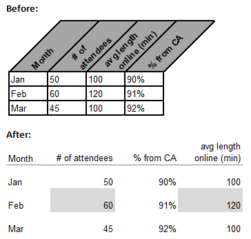
Hot Tips – What does a well-designed table look like? Here are a few best practices that can make a table quicker and easier to read and understand:
- Use fewer lines. They add clutter and fragment the data. Instead, use white space between columns and rows to make them distinct.
- When used sparingly, thin gray lines and light shading can help group or highlight.
- Orient text horizontally. Vertical or angled text is usually avoidable in tables.
- Align numbers to the right, text to the left, and format dates so that the number of digits is always the same.
- When arranging the order of columns and rows, think about what people are going to want to compare.
- Break large tables into a few smaller tables but be sure to think about how this might affect comparisons.
Rad Resource
Check out Stephan Few’s book Show Me the Numbers. It’s an excellent guide for creating effective tables and graphs.
aea365 is sponsored by the American Evaluation Association and provides a Tip-a-Day by and for evaluators. AEA is celebrating Data Visualization and Reporting Week. The contributions all this week to aea365 come from members of AEA’s Data Visualization and Reporting Topical Interest Group. Do you have questions, concerns, kudos, or content to extend this aea365 contribution? Please add them in the comments section for this post on the aea365 webpage so that we may enrich our community of practice.